Analytics hub
Client: Echobox, an AI-powered SaaS automation platform for publishers
Timeline: Nov 2022 - Apr 2023
Roles: UX Researcher, UI Designer and QA tester
Devices: Responsive desktop website
Technologies: Figma, FigJam, Zeplin, Jira, and Dovetail
Project overview
One Echobox product is Email, which allows publishers to automate their company’s email send-out fully using AI. This product was still young when I joined the company, lacking a major feature: a centralized place for analytics.
In demos and ongoing customer success calls, our users told us it was very important for them, and user research helped us understand why. Publishers needed to know how well their content and email campaigns were performing so that they could make data-driven decisions to bring even more readers to their websites.
I took this information and designed features to address their unfulfilled needs. We created the Analytics hub, which was quietly adopted by half of our users, with high recurring use.
Objectives
Given the resources we had to meet the users’ needs we could meet, we decided to focus on:
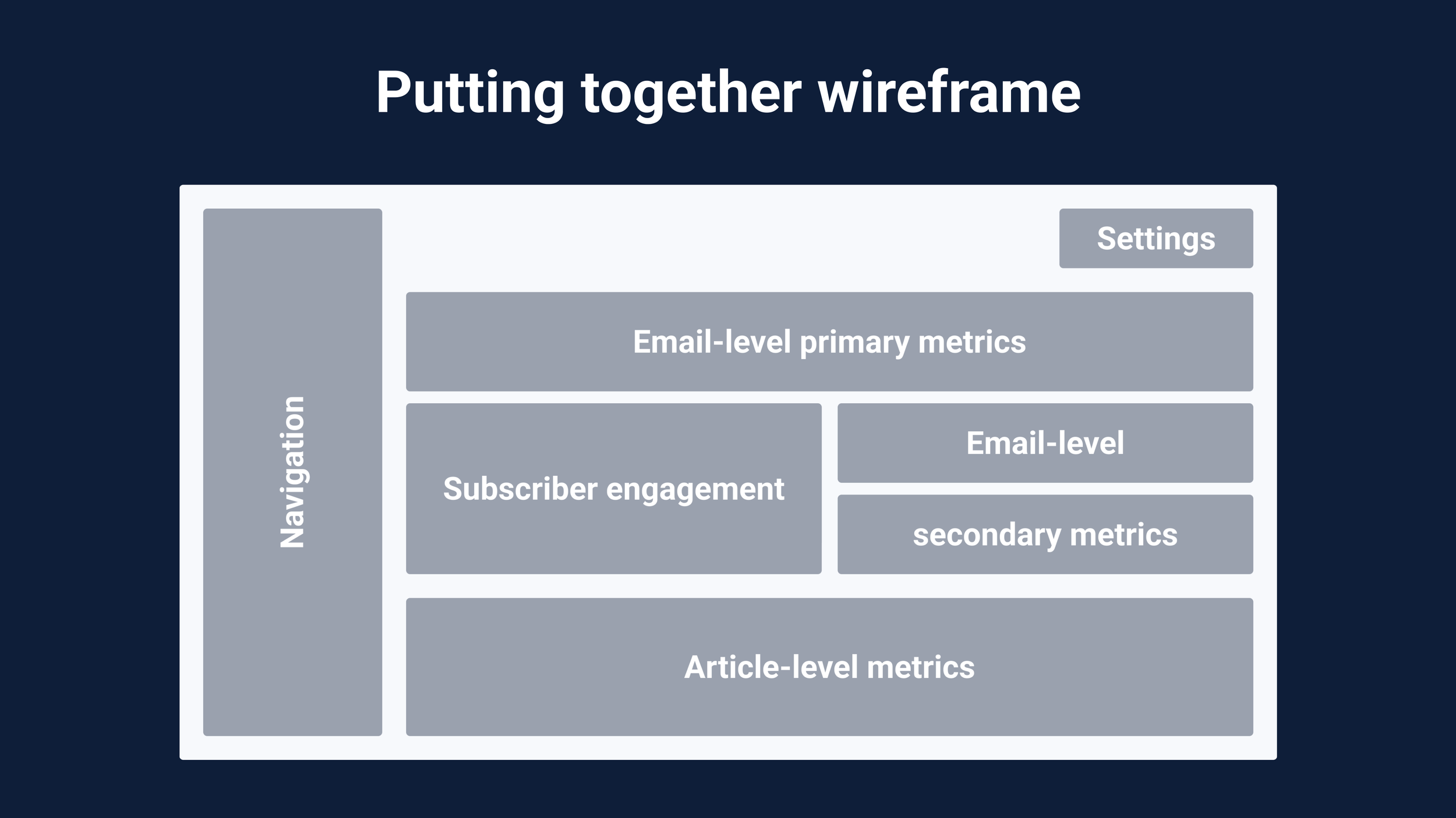
Designing dashboards of email email campaign metrics
Adding a breakdown of subscribers’ engagement levels
Creating a table of article-level metrics
Challenges
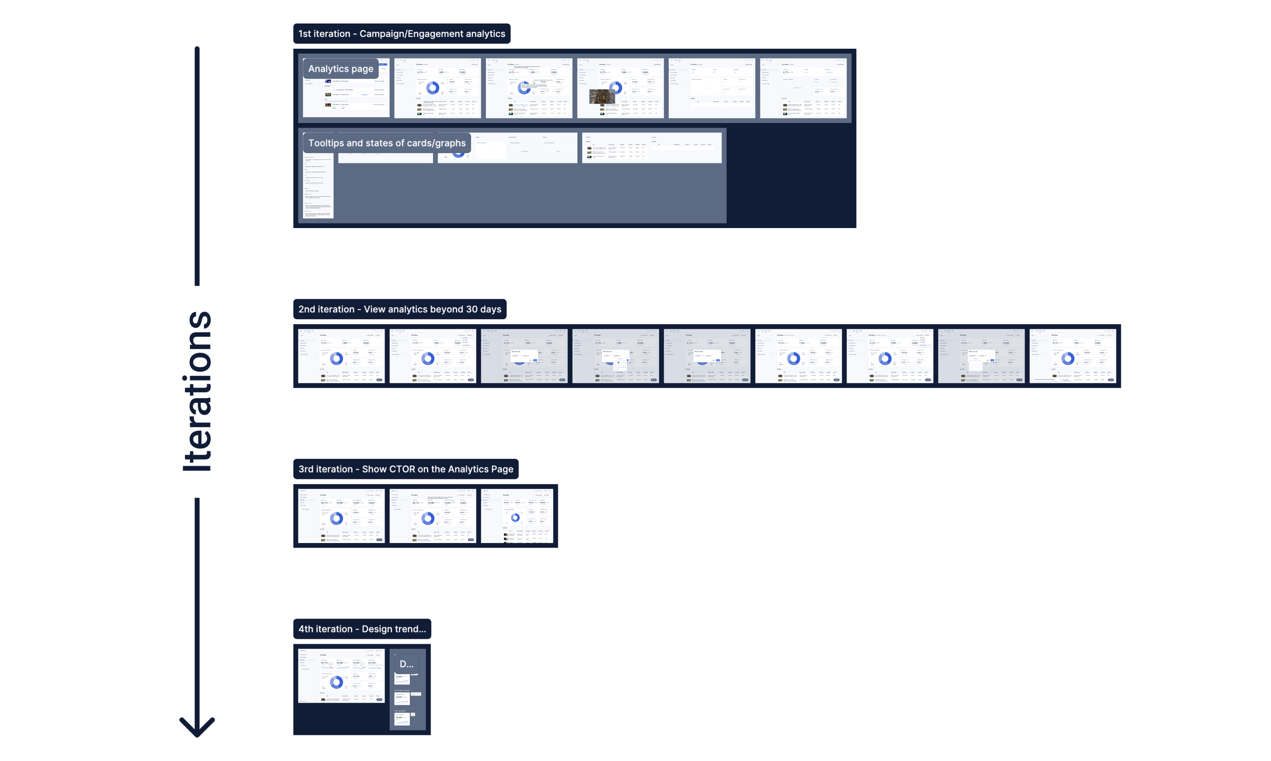
As it often happens, we knew what we should do, striving for the best UX, but didn’t have enough resources to bring all ideas to life. Therefore, we decided to work based on iterations, design what we could build now and what we couldn’t, and leave it for when we had the opportunity.
This proved to be beneficial as we managed to get feedback after each of the deployments, which then helped us refine what was implemented and better plan the next iterations.
Techniques and processes used
Competitive Research
Presentations
Design system and component building
Wireframing
QA testing
The Process

1. Going through research to identify users’ needs
This was the first large project I worked on for Echobox. The analytics hub was a core feature we lacked since the product's launch, and our users reminded us that they wanted it.
After I joined the company and started working on this project, I had some assumptions about why users needed this feature and what they wanted to see there. Wanting to find answers, I realized we had user interviews with some of our clients run by our PMs. I reviewed those and understood that our users needed detailed information about their email campaigns and content as they wanted to make data-driven decisions to improve performance and bring more readers to their websites.
It was then clear what we needed to do; we needed to show analytics at multiple levels but didn’t know how to. So, I looked into similar platforms (e.g. Mailchimp, Sailthru, Active Campaign, etc.) to see what this feature could look like, and I saw a trend of dashboards, graphs, and tables all displaying metrics and other values.
2. Ideating solutions for needed use cases
We came up with lots of ideas, but there were four that we believed could best fulfil our users’ needs:
Dashboards of the top metrics users mentioned they wanted (e.g. open rate)
A graph displaying the subscriber base segmented by engagement levels
A table of the top articles displaying detailed information
And a graph displaying the most popular topics for subscribers
I worked on all but the last idea since we didn’t have the data science resources for it and decided to park this feature for a future iteration.
Thanks to the competitive research, I identified what UI for those features could look like. On Figma, I then began designing them into quick low-fidelity wireframes that, after a few discussions, iterations, and more details, reached a high level of fidelity.
3. Gathering internal feedback and improving designs
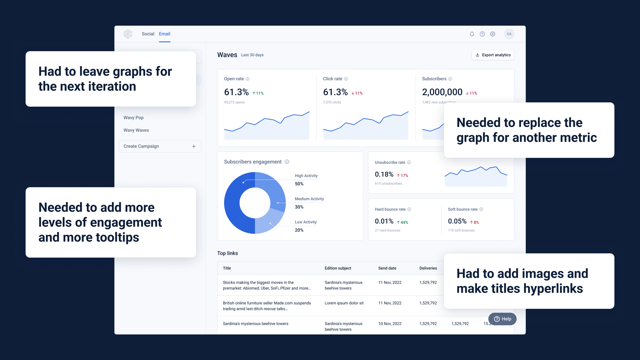
When I had put together a series of user flows with robust wireframes, I was ready to get more concrete feedback on this whole project and did so by presenting it to stakeholders in our weekly design critique. There, the feedback was around reworking the copy of the metrics’ tooltips, removing elements that would be added in later iterations, making sure all the metrics would resize accordingly in smaller desktop viewports, and tweaking padding.
I then addressed those points and reran the designs with the stakeholders.
Given the simplicity of the designs and that they were greatly influenced by what our users needed and what we found in similar platforms, we planned not to test it with users but directly release it and iterate it according to their feedback.

4. Handover, QA, and further iterations
Before I started the dev handover, I made the necessary Figma components, cleaned up the files, and exported them to Zeplin. I then make sure to explain the designs and the intended behaviour to the PMs and devs.
I was in charge of the component-level visual QA since we were also building our competent library in Storybook/Chromatic, and we needed someone to monitor this regularly.
After rounds of QA and bug fixes, the Analytics hub was put live, and we advertised it with an in-platform notification. We then received feedback and similar requests from our users and decided to iterate. We ended up adding features according to the user’s needs:
More metrics,
Direct links to articles,
The ability to view data in different time ranges,
And a way to visualize trends over time.
Conclusion
Outcomes
We developed the Analytics hub, a page now adopted by about 50% of our active users, where they can get detailed article-level metrics that help them guide their editorial decisions.
This feature then unlocked and closed multiple deals, resulting in a huge increase in the platform’s monthly email sendout and MRR.
Further testing and iterations
This page is constantly evolving to adapt to our users’ needs. Since its deployment, it has gone through multiple rounds of QA, of which I am part to ensure pixel-perfect resemblance (in both look and behaviour) to our Figma designs.
Since the first time our users saw it, and by multiple requests, we have added:
The ability to view analytics and their trendlines in different time ranges
The Click-to-Open rate metric
Direct links to articles
Thanks to the useful and intuitive designs expressed as such by our users, they were also included in our other product called Social (social media AI-powered posting automation) since their users also needed it.
The designs
If you want to check the designs yourself, I have put together the wireframes used in the different design tickets for this project here.