Email drag-and-drop editor
Client: Echobox, an AI-powered SaaS automation platform for publishers
Timeline: Jul 2023 - Sep 2023
Roles: UX Researcher, UI Designer
Devices: Responsive desktop
Technologies: Figma, FigJam, Jira, Dovetail and TestingTime
Project overview
Echobox is an AI-powered platform that allows publishers to automate their email send-out. It offers a series of features, one being the ability to design your emails, which I previously identified through research was not fully meeting our users’ needs.
Trying to assess this, I designed solutions that would enrich the email design flexibility we offer but were insufficient, and we knew this thanks to our user’s feedback. They still needed to reflect their company’s branding in their emails (to have a consistent digital experience), and with our current capabilities, they couldn’t achieve this.
Therefore, I decided to conduct more research and identified that I needed to design Echobox’s drag-and-drop email editor with a high level of design customization, AI-powered features and tools to help them automate processes and increase their campaign's performance.
Objectives
After hearing from our users, we knew Echobox had a major gap to fill in the area of email design flexibility. Therefore, I focused on the following:
Conducting user research to identify their specific needs and pain points
Translating findings into solutions that effectively address issues found in their workflows
Coming up with a plan to test our designs to verify whether they worked for our users
Challenges
How you would design emails in Echobox is far different from what other tools like Mailchimp and Active Campaign would be like. Our users told us they liked the features that made us distinct, but now, needing to bring features ubiquitously found in competitors, the challenge became:
How do we continue to innovate and set ourselves apart from the rest of our competitors while integrating conventional features?
Techniques and processes used
User interviews
Competitive Research
Presentations
Design system and component building
Wireframing
Prototyping
Usability testings
The Process
1. Researching to identify what needed to change
In this company, we would put great effort into listening to user’s feedback. This is partly how we discovered that the features I recently designed, aiming to provide more design flexibility when designing emails, were insufficient. In demo calls, prospects told us our platform lacked a high level of email design customisation.
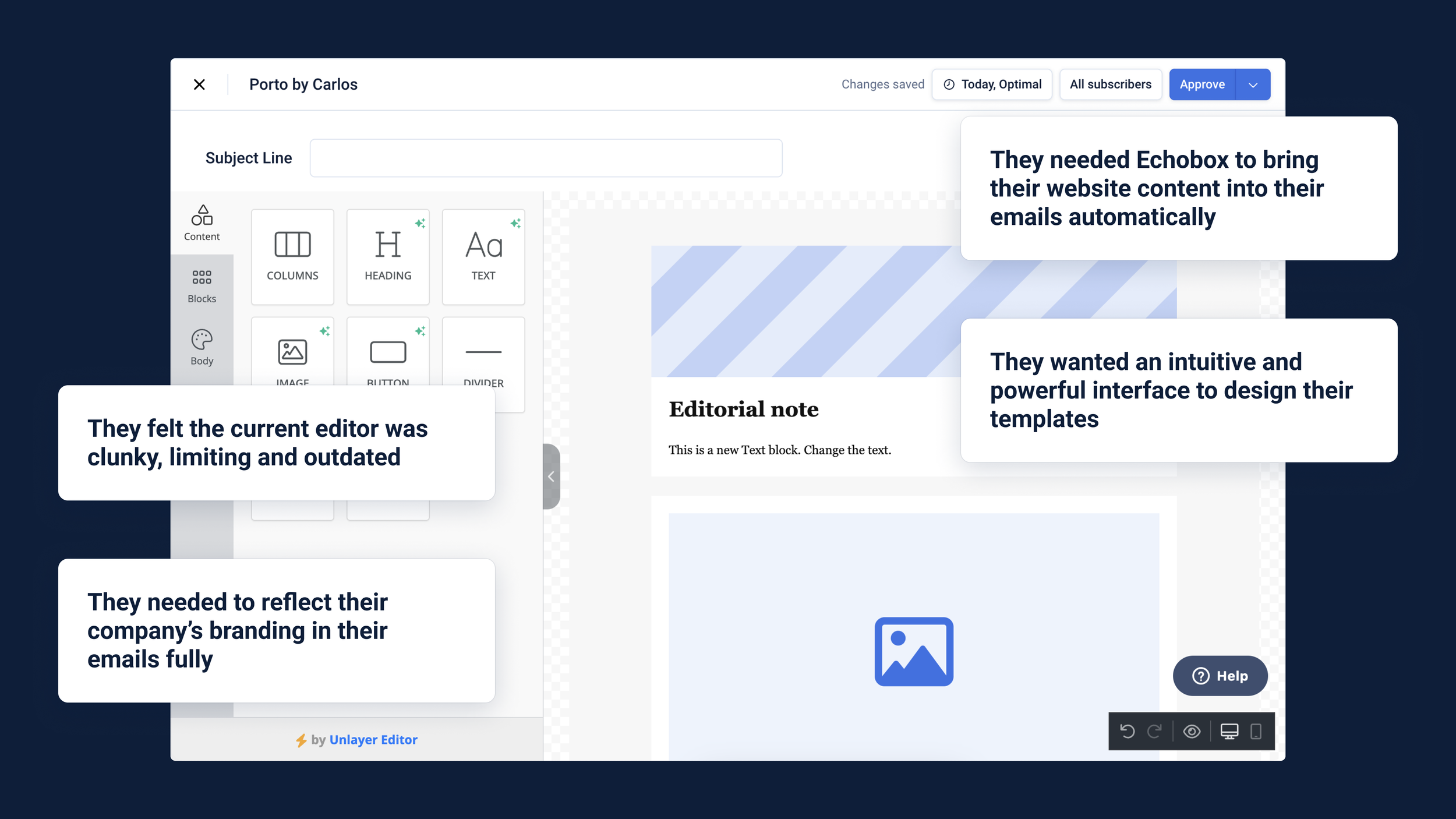
Another insufficient feature was the third-party email editor (image on the left) we have on the platform. It didn’t fit with our users’ workflows since it didn’t use Echobox’s unique AI-powered features, and the lack of intuitiveness and flexibility caused frustration.
Now, trying to understand how we could properly address our users’ needs, which was to help them reflect their company’s branding in their emails (to achieve a cohesive digital appearance), I decided to interview similar users to ours. Publishers in charge of their company’s email send-out who would use platforms like ours.
We understood that an intuitive interface to design their email templates, with a high level of customization for the building blocks (e.g. image, text and button), was needed. I then looked in more detail at email editors in our competitors to identify which features we needed to include in our solution and how they should look and work.
2. Translating findings into user flows and designs
From the user research and benchmark conducted, I knew I had to create Echobox’s drag-and-drop email editor, but in more detail, I had to design:
Different types of blocks to let users build their desired template
High level of customization of those blocks to make them look the needed way
Integrate preexisting unique Ecbobox features into new designs so that our users will continue to benefit from them
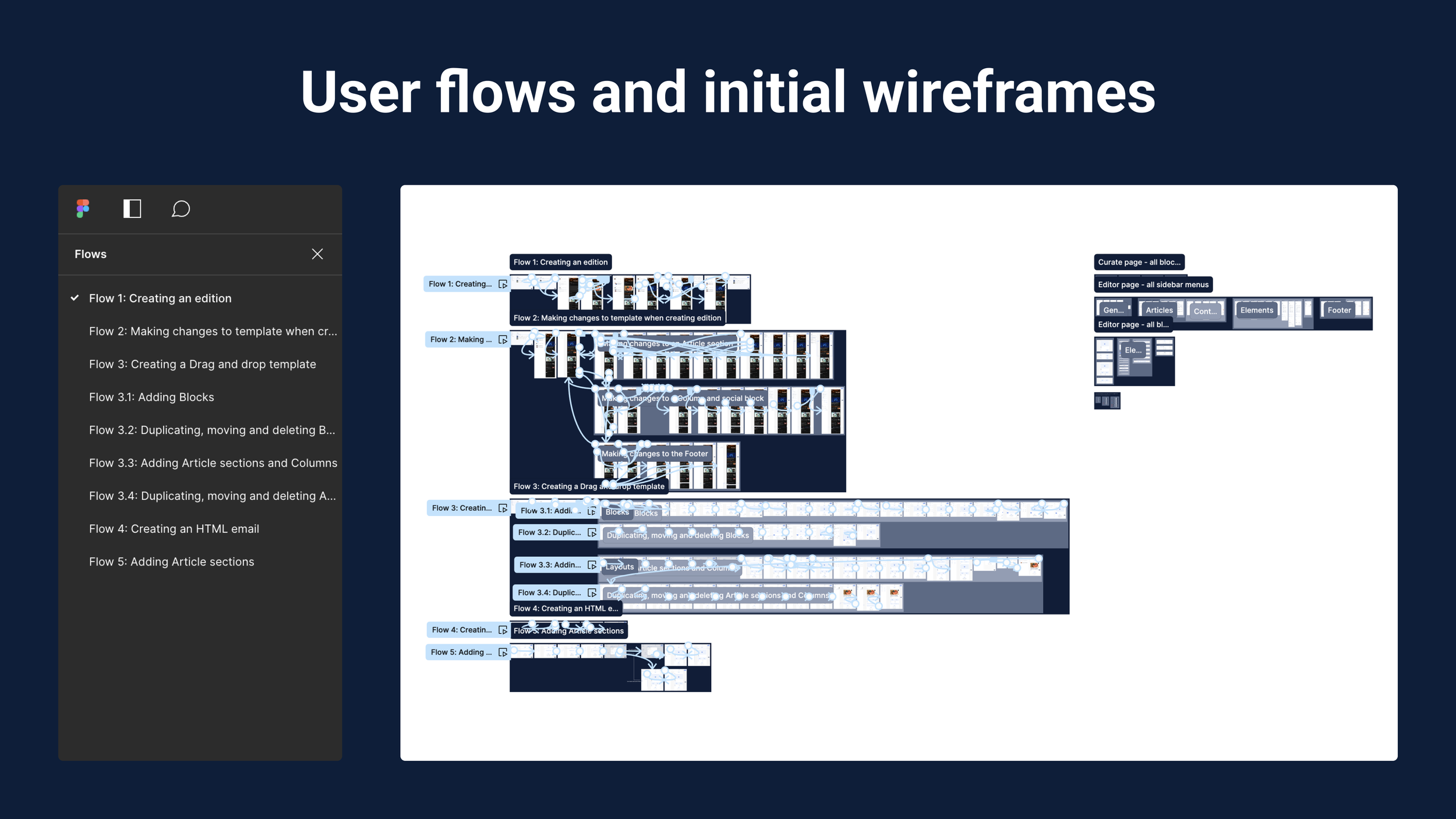
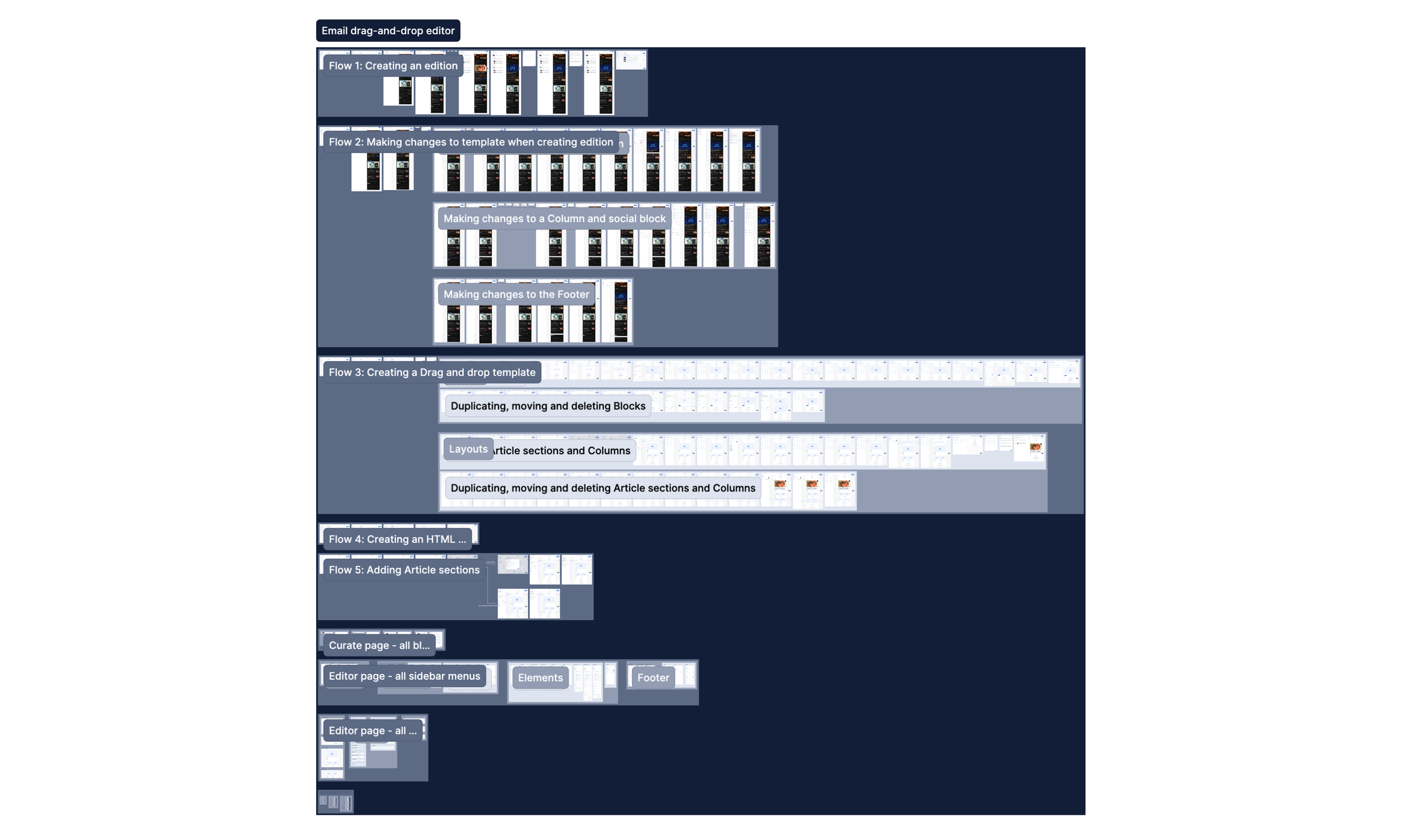
Given the number of pages and components I had to cover, on Figma, I started with simple wireframes to design specific bits. I would check them internally with the product team to iterate, add more details and get them to a robust state where they could be prototyped to resemble the user flows we would need to address (e.g. creating your first email template) and display the behaviours the dynamic template would have.
3. Iterating prototypes and addressing challenges
As soon as I had covered the different user flows with their distinct prototypes, I would start presenting the designs to our stakeholders in our weekly critique meetings. There I would gather the feedback I would use to iterate the designs, continue to improve them and cover unaccounted cases.
There were many rounds of iterations since the designed flows didn’t feel organic and intuitive. I would try to make our UI look too close to what other platforms were doing in the quest of having those design conventions. I addressed this challenge by remembering the core features that made Echobox unique and that users loved, and what were purely the bits we lacked.
I designed a workflow in which users, with the click of a button, would let Echobox automatically generate an edition for their email campaigns, pulling the content from their website. The edition would use a highly customizable template that would only need to be set up once, and after that, going to the editor would be optional. In this way, we would reduce friction by removing manual work and leaving more time for editors to make sure their emails look as they want to.
4. Testing the designs and next steps
After finishing the first iteration of the designs, I had planned to run a series of usability tests to assess whether users would understand the designs, flows and things they could do. Unfortunately, the process of this project was paused due to a lack of resources,
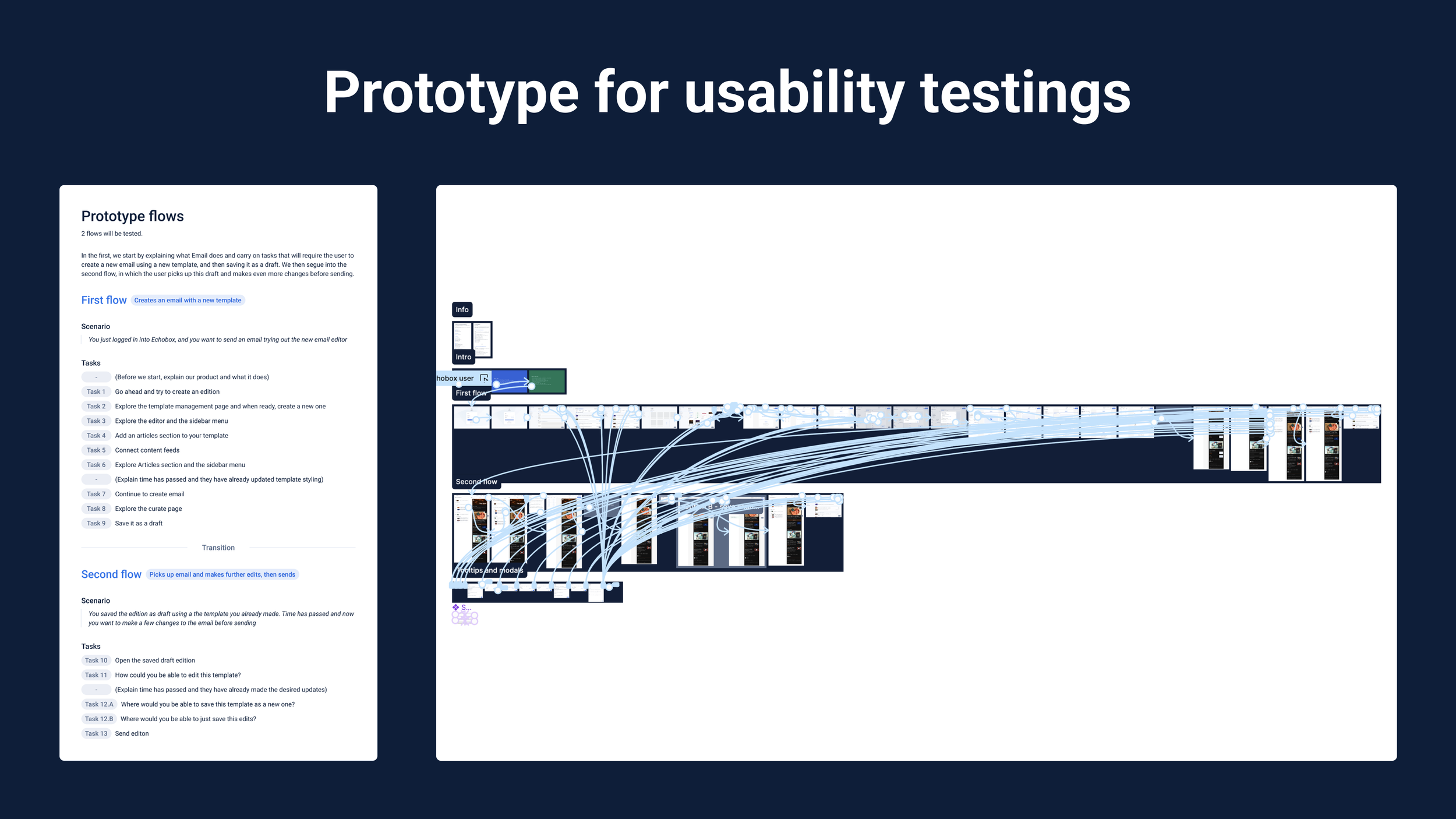
Still, the plan consisted of a task-based script the users would have to follow; I would guide them by asking them to complete the tasks to achieve the two overall goals:
Creating an email with a new template
Picking up that email and making further edits before finally sending it
I intended to run these tests with our users to get more nuanced feedback. I would have started with five and, after gathering the feedback, and iterating accordingly, decided if a second round was necessary (if, for example, some designs had changed drastically).
Finally, I would have organised the files, handed them to the dev team and QA all the components I created.
Conclusion
Outcomes
Even though this project hasn’t gone live yet but given that I devoted significant efforts to research and ideate user-centric designs, I came up with:
Echobox’s very own drag-and-drop email editor that fulfils our users’ needs and addresses their frustrations with the previous solutions.
A redesigned workflow for curating and designing emails that retains all the features our users love while integrating a high level of design customization.
Together, they would allow our users to reflect their company’s branding in their emails, thus achieving a cohesive digital visual identity.
Next steps
As mentioned, the process of this project was paused due to a lack of resources. Still, I had planned to run a first-round usability tests with five users, given the high-risk quality of it.
I would follow the structured script I wrote to guide the users through a series of steps I would ask them to complete to see whether the interface I came up with was intuitive enough for them to understand how to use it.
Then, use the gathered insights to iterate the designs and repeat the process if the designs have changed drastically. After this, hand the designs over to the dev team for implementation.
The designs
If you want to check the designs and prototypes for yourself, I have put together them here.


