
Full Home Tab Templates and Navbar
Client: The Spectator (1828), a digital/print publishing company
Timeline: March 2022 - Jun 2022
Roles: UX Designer, UI Designer, QA Tester
Devices: Mobile and tablet (portrait and landscape), mobile-first approach
Technologies: Figma, Contentstack (headless CMS), Keynote and Jira
Project overview
Objectives
This project was requested by the Chairman of the company in conjunction with the Editor-in-Chief due to the fact that the designs of the app’s Home Tab were outdated, for they lacked the new sections and templates implemented on the website, and because the app had a lot of wasted space (specifically in tablet) instead of a lot of articles. Therefore they wanted the layouts to be redesigned and they asked me to:
Redesign the Top Section templates, mimicking the website and displaying content grouped by topics.
Redesign and introduce new sections to the tab, maximising the number of articles on different devices.
Update the navbar, to allow for more space in the following templates/sections.
The Challenge
The Spectator is a publishing company, whose editorial and production stakeholders are very knowledgeable about how a magazine should present its content, and have had an app that has far too much white space (and not enough articles), the complexity of this project lies in the following challenge:
How can we make the app layouts resemble the ones of a real dense magazine while maximising the use of the space on various screen sizes and accounting for unpredictable content dimensions?
Techniques and processes used
Benchmarking and Competitive Research
Presentations
Style Guides
High fidelity Wireframes
Prototypes
QA testing
App Preview and Screenshots
The Process

1. Competitive research and synthesis
Starting this project, having a clear understanding of how the competitors were displaying content on both mobile and tablet (portrait and landscape) was crucial as the complexity of the project required an almost paradoxical answer.
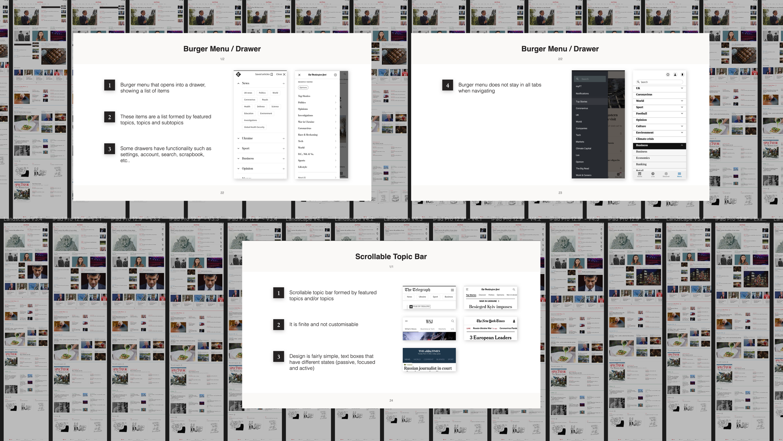
I compared the Home Tabs from the apps of multiple competitors across different devices, for a few weeks, and discovered not only that the actual sections and their organisation (which one went first, second, and so on) changed, but that they managed to reduce the white space by changing the alignment of entire cards and elements inside of them (e.g. tags and images) to adjacent cards or elements making an illusion that in actuality the white space was meant to be there
I also compared Navbars and found that in contrast to us, the use of illustrations was rather unique and that competitors went for a simple text box, without images, scrollable topic bar
2. Fixing preexisting issues, ideating and designing
Because at the start of the design exploration there was work being done to fix the code base of the app, which was overcomplicated, and because there was no Style Guide for the app, I decided to work closely with a Senior React Native Developer to aligned the styles and components of the code with the Style Guide that I was creating, to ensure a seamless handover and easier implementation of the designs in the future.
After the work was done, I then began by exploring ways to merge the templates from the website to the ones from the app, updating them to maximise the space allocated to articles and seeing how all the layouts translated across different screen devices. I did this with a mobile-first approach, and after having robust screens, I moved into the portrait and landscape and then created sets of prototypes.
Remembering the challenge of this project, I tried to solve it by designing different Top Section templates, for a different number of articles published in a day, and creating sections that had different layouts depending on the device and orientation (for mobile and tablet portrait and tablet landscape), whose elements would rearrange to fill in the gaps of white space.
3. Selling the concept and iterating on it
Having prototyped the screens for different devices, I put together a Keynote presentation utilising the research done and highlighting the distilled insights to help sell the directions I took for the designs. It was directed to the Editorial team and even though I received great feedback, they wanted to go further with the design changes.
They asked for more tailored-to-the-device changes in the Top Section and after many subsequent rounds of iterations, I came up with totally different templates for mobile and tablet, with variant numbers of articles, that best-fit them in the different screen sizes. Apart from that, small typography and image alignment fixes had to be made, and so I did.
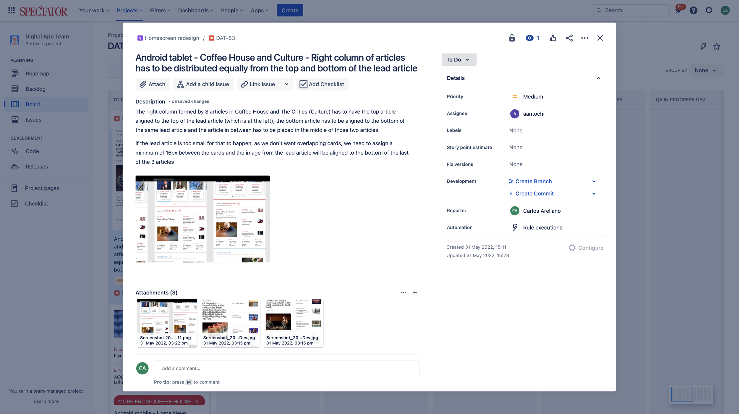
4. Dev handover and manual QA testing
After consolidating the final designs, I organised the designs and moved them into a ready-for-development file, I had catch-ups with the dev team (of two) and explained the designs and intended behaviours of the various cards, layouts and templates. I also updated the app preview and screenshots for both the Play Store and App Store.
Worth mentioning that even before finalising the designs, I had already had catch-ups with the dev team to ensure that what the Editorial team wanted to be done and that what I wanted to design was indeed feasible in terms of code and implementation timelines.
With the deployment of the redesigned assets into the Dev environment, I moved into QA testing all that had changed and writing and raising issues on Jira, and after them being fixed, checking back again. This process was repeated when these new design changes were deployed in the Preview and finally, into the Live environments.
Conclusion
Outcomes
In terms of designs, after many iterations, I came up with:
New Top Section templates of variant density, to mimic the website’s ones and offer the user manually curated and grouped-by-topic content that best fits their devices.
Highly dynamic layouts for the different sections of the Home Tab, that would minimize the white space across different screen sizes.
Updated Navbar, smaller and cleaner.
In terms of performance, as for the first week of June, we are still collecting data.
Further testing and iterations
For this project, we ran multiple internal sessions of testing where we identified issues and fixed them accordingly. We did this for each step of deployment (Dev, Preview and Live) and continue to do so as I came up with more iterations and changes to be made, requested by the Editorial Department, to accommodate for new features and redesigns.
After this project, I started to tackle the redesign of the Article Tab, and with it, I went back to the Home Tab to apply small changes and make sure both designs stayed inline (aesthetic and functionality-wise.)
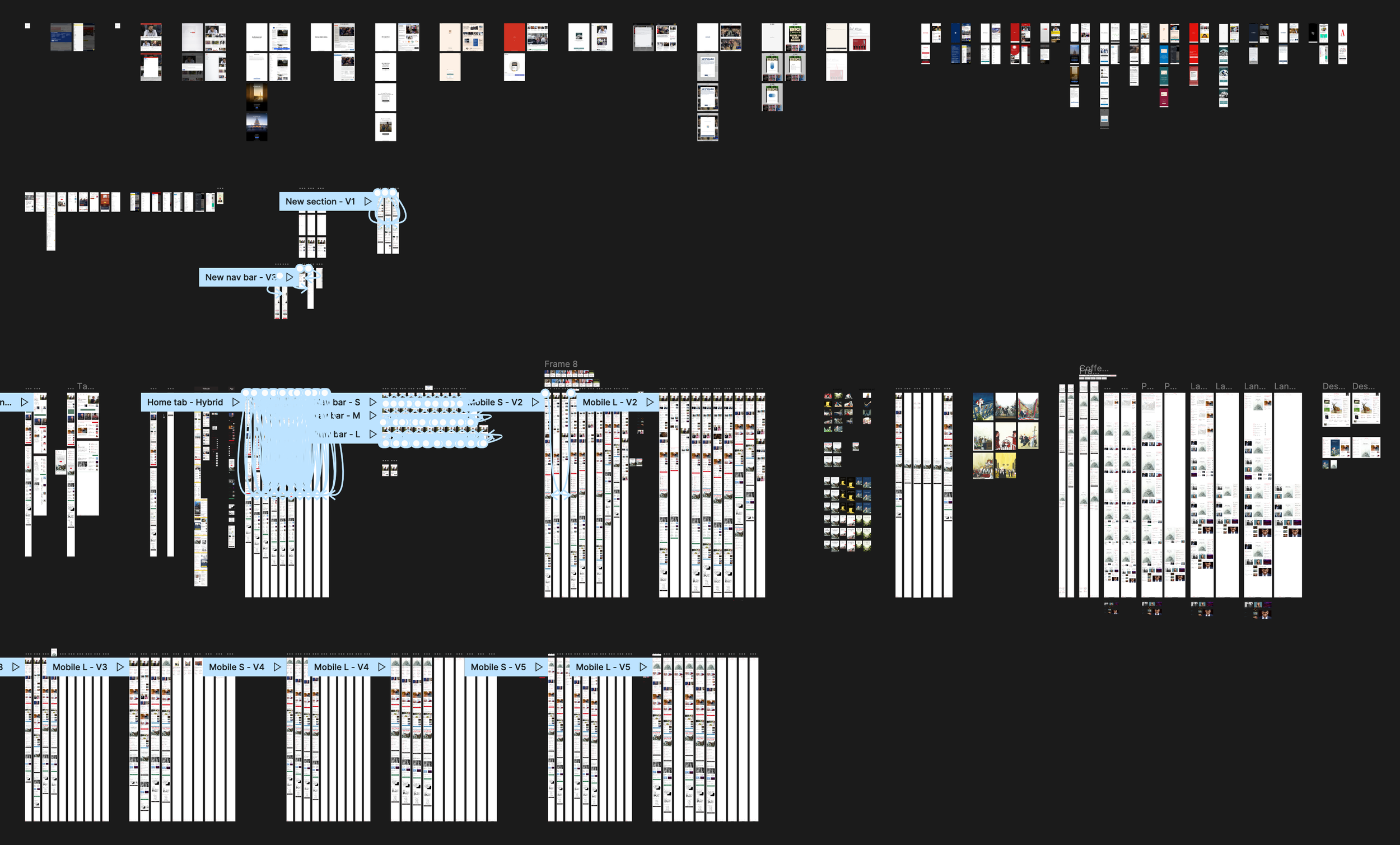
The designs
Below I have attached images of all the final designs, but in case you want a look a closer look at them, you can check these prototype links:
Small Mobile designs here
Big Mobile designs here
Small Portrait Tablet designs here
Big Portrait Tablet designs here
Small Landscape Tablet designs here
Big Landscape Tablet designs here
Just make sure to check the flows panel, which can be accessed through the top left icon next to the Figma icon (colourful F icon.)
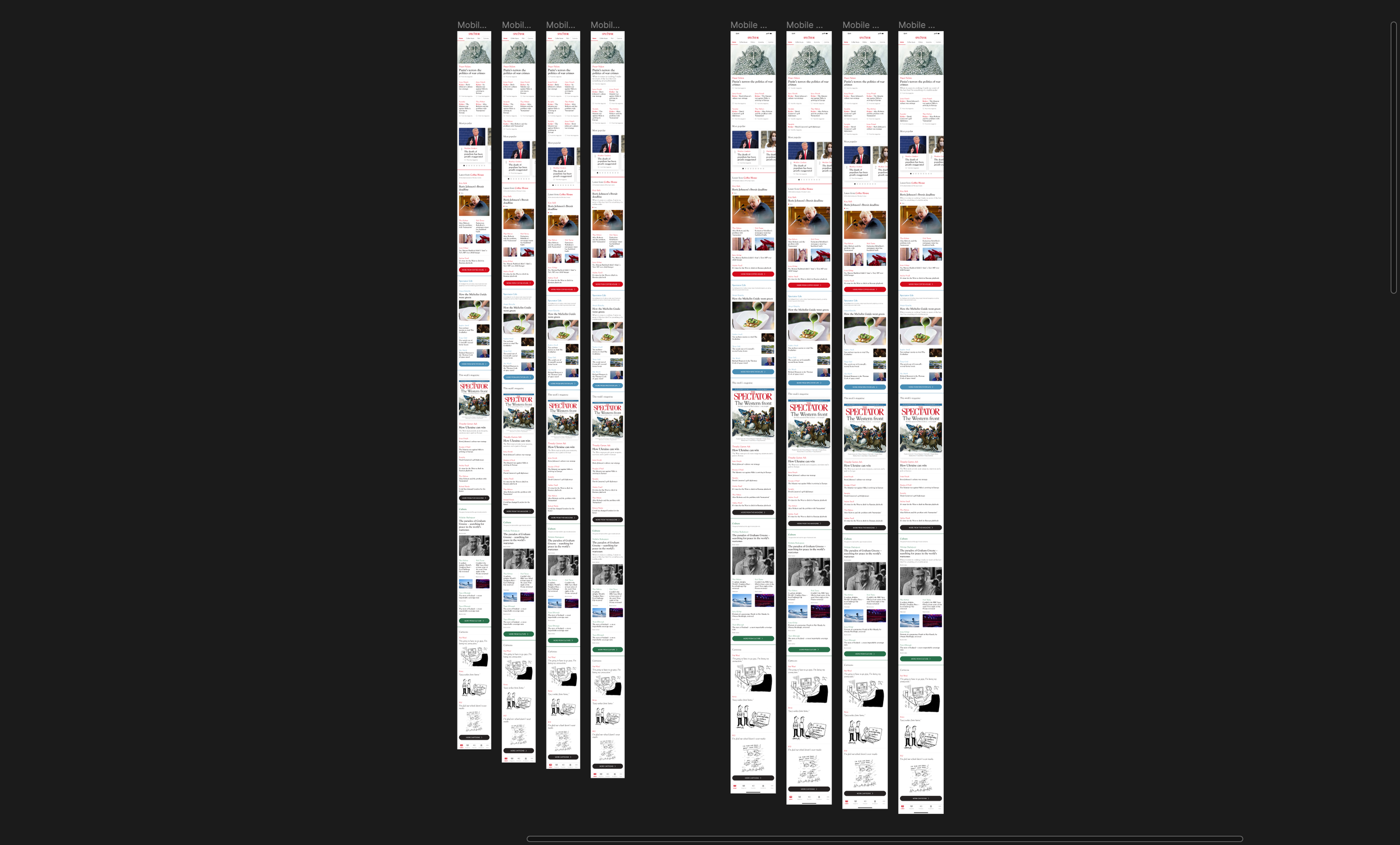
Mobile designs - Small (left) and big (right)
Tablet (Portrait) designs - Small (left) and big (right)

Same breakpoints but with the Featured Topic section, of 2 and 3 articles
