
Home Page Top Section Templates
Client: The Spectator (1828), a digital/print publishing company
Timeline: May 2021 - Aug 2021
Roles: UX Designer, UI Designer, QA Tester
Devices: Responsive website, desktop-first approach
Technologies: Sketch, Figma, Miro, Contentstack (headless CMS) and Keynote
Project overview
Objectives
This project was requested by the head of the Digital Department, as he and the company felt that the layouts of the top section of our home page weren’t doing a good job at presenting enough content and its variety to users, therefore they wanted me to:
Redesign the layouts of our preexisting templates (Default and Magazine day) to fit more articles.
Explore new ways to present content that reflect different topics, different from the current templates.
Later on, they requested for the following features to be included in the same templates:
For very important topics, have the option to display a more visually distinctive section of related articles.
For A/B testing purposes, have the option to display a Most Popular feed at the top of the page.
Now, the content of both templates and features had to be fully editable through our Content Management System (i.e. CMS), which is Contentstack.
The Challenge
Apart from being my first project in the company, and having to migrate files and build upon the Style Guide from Sketch to Figma (the software where I do my design work), the main issue was:
How can we show the user more content and more topics in limited space while also having dynamic sections that will ultimately take their space?
Techniques and processes used
Benchmarking and Competitive Research
Presentations
Style Guide
Low to High fidelity Wireframes
Prototyping
QA testing
The Process
1. Gathering requirements and research
To begin the project, I had meetings with my PM and the Head of Digital, to fully understand their motivations and considerations behind the project what was exactly what they wanted to achieve, which was primarily to increase the number of articles and topics shown to users as soon as they open the website (top section.)
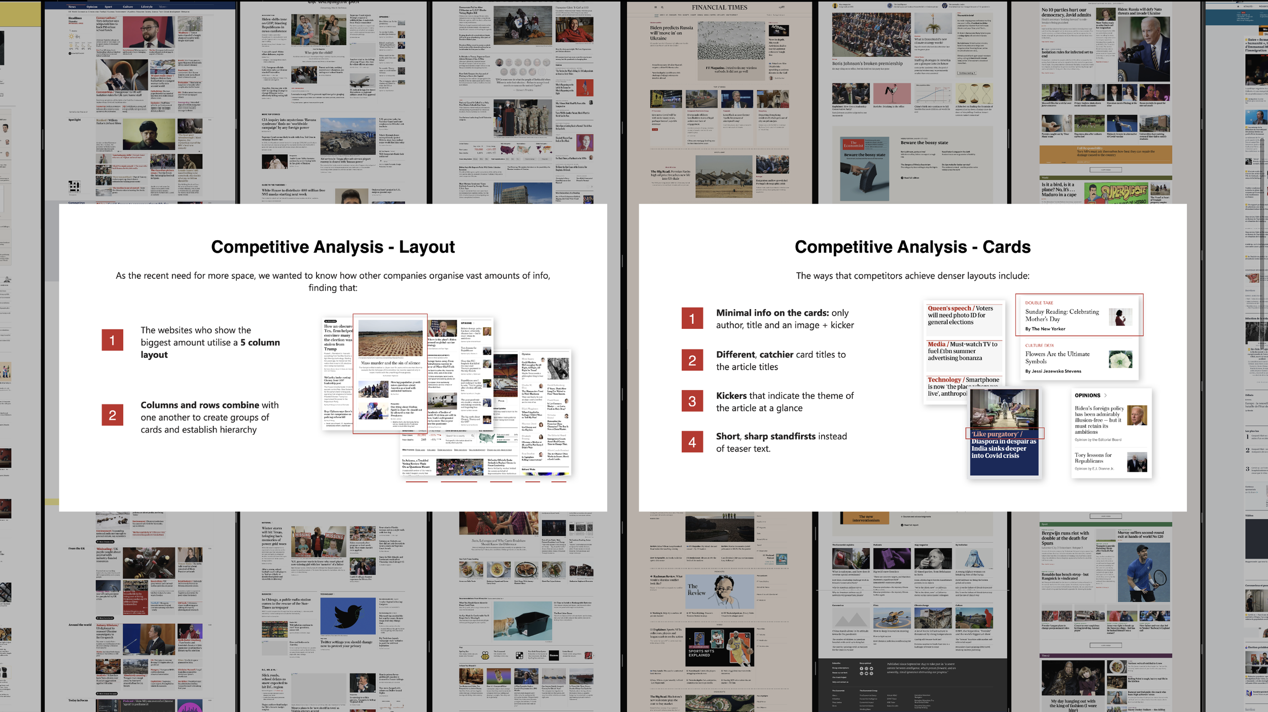
I then conducted competitive research to identify what were the trends regarding the composition of templates and design of cards and discovered that publishing companies that have more dense templates, grouped content by similar topics, and some of them use even used kickers to give a hint to the user of what the article was about, which also helped to ditch naming the groups and lengthy explanatory titles, reducing the overall size of article cards.

2. Ideation and design
Having synthesised ideas into design choices that I wanted to explore, I began to design desktop-first wireframes (i.e. screens of variant fidelity that will resemble the look of the final screen) and check my progress with my PM to ensure we were going in the desired direction. I added more and more details until we had a set of different layouts that would serve for different types and numbers of articles, creating then the templates.
Going back to the challenge of the project and what we wanted to achieve, the temples were designed by a composition of groups of articles related to topics and the main categories of the website with the help of kickers and colours (which relates to the main categories of the website.) And the two additional features, the more visually distinctive group of articles and the Most Popular feed, would take place in the same groups, but would also be formed by articles grouped by topics.
In the middle of the actual design process, I made the decision to move from Sketch to Figma, as I believe it would streamline many processes, such as the dev handover as well as being able to share and edit prototypes in real-time with stakeholders and immediate team. While doing this, I also migrated and build upon the website Style Guide and master files, as they haven’t been updated in over 2 years (since the launch of the new website.)

3. Design presentation and iterations
After having designed robust prototyped screens for the different templates we wanted to propose, I put together a presentation to sell the concept to the rest of the company, principally the Editorial Department (as we are a content-based company and they will have to manage the templates themselves through the CMS), I presented the project and got great feedback.
We consolidated 3 different templates, the Low and High-density (for when we have less and more content, respectively) and the Magazine special template (for Thursdays, when the magazine gets published online). We also had to make some iterations to comply with their more specific needs, for example, making some articles appear more visually relevant than others and removing the kickers from the lead article and feeds (as it would be too much work for them, as kickers are manual work.)
I updated the final desktop designs and went on to design the rest of the breakpoints (our website has 4 in total, desktop, laptop, tablet and mobile) and went back for a final round of feedback with the Editorial team and applied their feedback.

4. Dev handover and manual QA testing
The dev handover was quite fast and easy; I organized meetings with the dev team to explain the final designs, which they already had a prior understanding of them as I believed it was important to get their opinion on the designs and what was feasible to implement. The dev team got access to the files through Figma, and there, they could use the inspect tool to get detailed information about the assets.
Because I reworked the Style Guide to match the naming of colours and typography to the code base, as well as components, it was easy for the dev team to understand and create the components with what we already had on the same codebase.
It took around 3 months to implement the 3 templates and additional requested features, which also followed the same process. While the dev team was implementing the designs, I continued to design the new features, and as soon as I finished with them, I went right back to QA testing the latest designs implemented.
Conclusion
Outcomes
In terms of designs, to solve the issue of lack of enough articles and the variety of content, and also, the features that the company wanted, I designed:
Low and High-density, and a Magazine special templates that accommodate the amount, and type, of content published in a day, and the ability to edit all the content inside of them through our CMS. They are constructed by a lead article, a feed of the latest articles of a related category, and groups of articles (grouped by topic) that use kickers to help users understand what the article and topic are about.
Featured Topic sections (FTS) of different densities, for more important and up-to-date topics.
Most Popular feed for A/B testing.
In terms of performance, in the top section, in general:
32% increased click-through rate, specifically when using the High-density template.
11% increased click-through rate on articles when the group they are in have a clear topic, helped by a clear kicker.
9% decreased click-through rate when having the Most Popular feed on.
Further testing and iterations
For this project, continuous QA testing was conducted by my project manager and myself days after deployment on the dev, preview and live environments, and we ended up fixing small design bugs and tweaking the design (mainly paddings.)
Unfortunately, due to time constraints, we couldn’t conduct usability tests with real users to further improve the templates and features designed. Although, we tested the templates and use of kickers with the Editorial team (as they are the ones who manage all the articles) and found that simpler, less wordy, kickers made users more likely to click on the article card.
The designs
Below I have attached images of all the final designs, but in case you want a look a closer look at them, you can check these prototype links:
Just make sure to check the flows panel, which can be accessed through the top left icon next to the Figma icon (colourful F icon.)
Home Page - Low-density Template

These are the Desktop, Laptop, Tablet and Mobile breakpoints
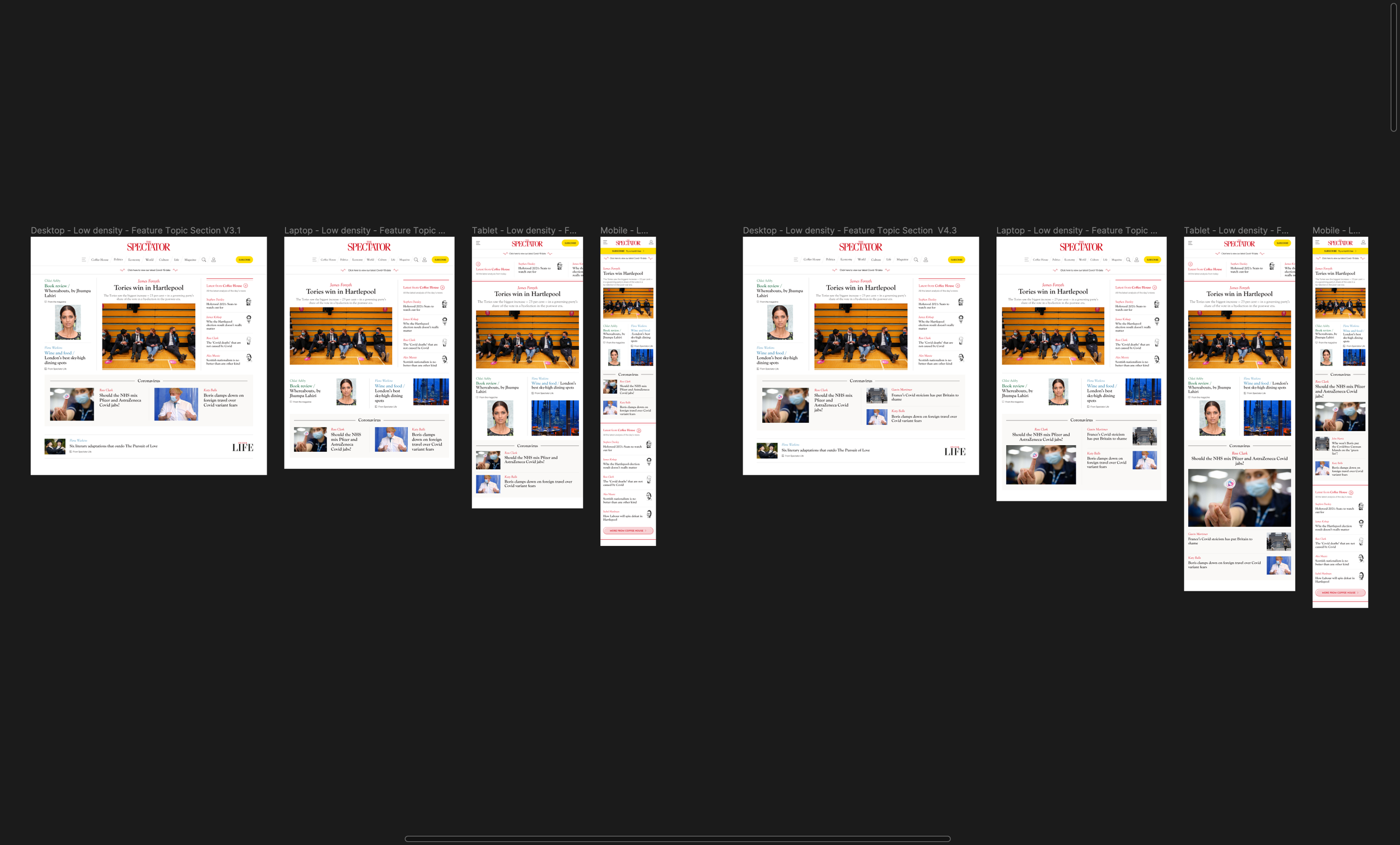
Same breakpoints but with the Featured Topic section, of 2 and 3 articles
Home Page - High-density

These are the Desktop, Laptop, Tablet and Mobile breakpoints, with a cartoon and article on the feature slot

Featured Topic section, on the top and bottom of the template, of 3, 4 and 5 articles

Most Popular feed being used above the Coffee House feed
Home Page - Magazine special

These are the Desktop, Laptop, Tablet and Mobile breakpoints, with the Magazine and Coffee House feeds

Most Popular feed being used above the Magazine and Coffee House feeds