
Navbar and Footer
Client: The Spectator (1828), a digital/print publishing company
Timeline: Aug 2021 - Jul 2021
Roles: UX Designer, UI Designer, QA Tester
Devices: Responsive website, desktop-first approach
Technologies: Figma, Miro, Contentstack (headless CMS), Keynote and Monday
Project overview
Objectives
This project was requested directly from the Editorial Department, particularly by the Editor-in-Chief, and the purpose of it was to solve the ever-present issue of not being able to display current and relevant categories as well as our many new topics being difficult to find. More specifically, they wanted me to:
Redesign the navbar to present the growing list of categories and topics.
Improve findability of categories and topics on the opened navbar.
Match the design of the top and bottom navigations.
The Challenge
Due to Covid-19, and with an upsurge of subscribers, there has been an increase of content published every day ever since and because our website (of 3 y/o) hasn’t had any new designs added, we were facing overall issues of not being able to show the user all the new topics that were now being covering. Therefore, the main challenge we were facing was:
How can we switch from a brand exploration to a content-driven navbar strategy?
Techniques and processes used
Benchmarking and Competitive Research
Affinity Mapping
Presentations
Low to High fidelity Wireframes
Prototyping
QA testing
The Process

1. Competitive research and synthesis of insights
Before starting to design anything, I wanted to have a clear understanding of what our many competitors were doing regarding their top navigation; see which categories/topics they were displaying first (i.e. featured ones), and how they were presenting them (i.e. the hierarchy) and how did they organize them (i.e. type of grouping.)
After comparing their websites and highlighting the trends, I realized that we should implement the ability to edit our featured categories/topics so that the Editorial team would always be able to choose and display the current and most important ones; and that the new navbar had to be composed, once hovered and opened, by groups of categories/topics with their respective subtopics.
Thanks to the Affinity Map that I did (in the image at the left), I discovered the most popular and accessible naming of topics and groups of content and decided to suggest changing the names of some of our own topics and categories (the ones that were ambiguous), to more understandable names (e.g. Coffee House to Latest)
2. Redesigning the assets, presenting and applying feedback
With clear insights and direction from PM, after catching up on the research, I began by recreating the current designs from the website and started to apply the necessary changes to them with a focus on desktop-first approach wireframes, as the components were more complicated (UI wise) on our desktop breakpoint.
Thinking about our challenge, and because they were already in the footer, I decluttered the navbar of unnecessary links that directed users to related websites of our brand, and gave the navbar freshen-up design, focusing on the four categories of our website and their subtopics, which are; Coffee house (politics, economics, society, etc…), Culture (books and arts), Life (current affairs and lifestyle) and Magazine (content that comes directly from there.) I also updated the colours and links of the footer to make it more cohesive.
Due to the fact that this wasn’t a project that we had to “sell to the company”, before showing anything to the Editorial team, I made sure to have robust prototyped screens, across breakpoints, to help illustrate the vision and direction we took according to the research. We had then a meeting with the editorial team, made the requested changes to the design (e.g. increasing font sizes and size of caricatures) and consolidated the categories and topics that were going to change.

3. Dev handover and manual QA testing
After the final round of iterations, I made sure all the designs were “cleaned” for the implementation of this project, we worked together with a senior developer contractor, provided by an agency. Using Figma, and having recurrent small catch-ups, I ensured that what I designed was indeed feasible to implement as well as shared in a way that was straightforward to inspect.
The new components were deployed to our Dev environment where I thoroughly QA tested and raise the bugs found as issue tickets in the project management tool called Monday, then deployed to the Preview and Live environment, where they followed the same testing process.
Conclusion
Outcomes
In terms of designs, after implementation and final iterations, we came up with:
A new navbar that focuses on the discoverability of content, doing a great job at presenting our brand personality and ever-growing list of topics.
The ability to edit the featured categories and topics to ensure that the user gets the most important ones.
A footer with a simpler design, matching the updated navbar.
In terms of performance, with the switch from a brand exploration to a content-driven navbar strategy, we achieved:
27% more clicks on categories on a closed navbar, these being the featured categories.
15% more clicks on subtopics on an opened navbar.
Further testing and iterations
Due to lack of time, I couldn’t test the designs with real users before going live, but I did manage to test them with the Editorial team and find any unforeseen issues, from their perspective, before the deployment. In those usability tests, I discovered that there would be cases where more (than intended) featured categories were going to be used, therefore I had to make small adjustments to paddings and font size to have enough space to display them all.
After the deployment and release, subsequential small adjustments from the same type were made, mainly to accommodate redesign assets (e.g. the new Meter Journey assets.)
The designs
Below I have attached images of all the final designs, but in case you want a look a closer look at them, you can check these prototype links:
Just make sure to check the flows panel, which can be accessed through the top left icon next to the Figma icon (colourful F icon.)
Navbar - Desktop breakpoint
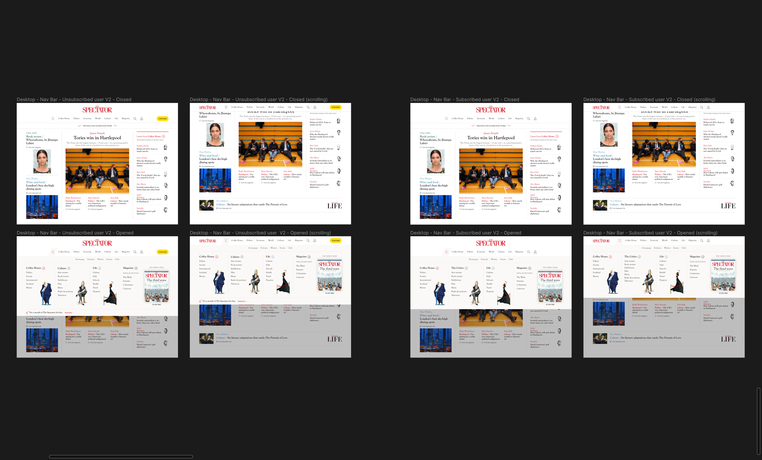
On the left, for unsubscribed users, and on the right, for subscribed users
Navbar - Laptop breakpoint
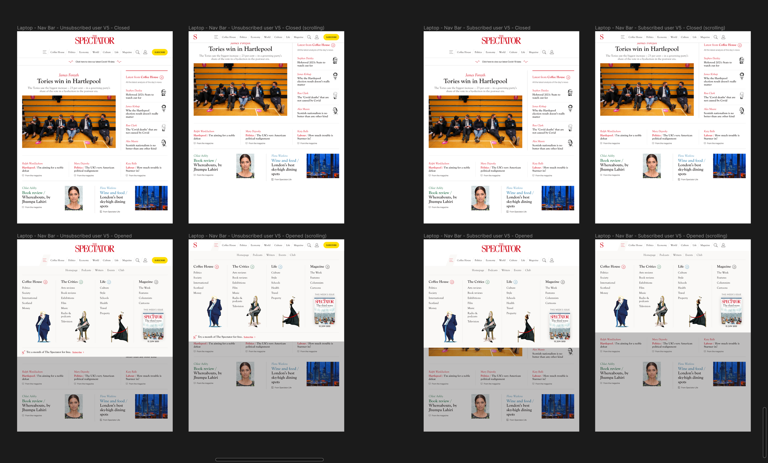
On the left, for unsubscribed users, and on the right, for subscribed users
Navbar - Tablet breakpoint
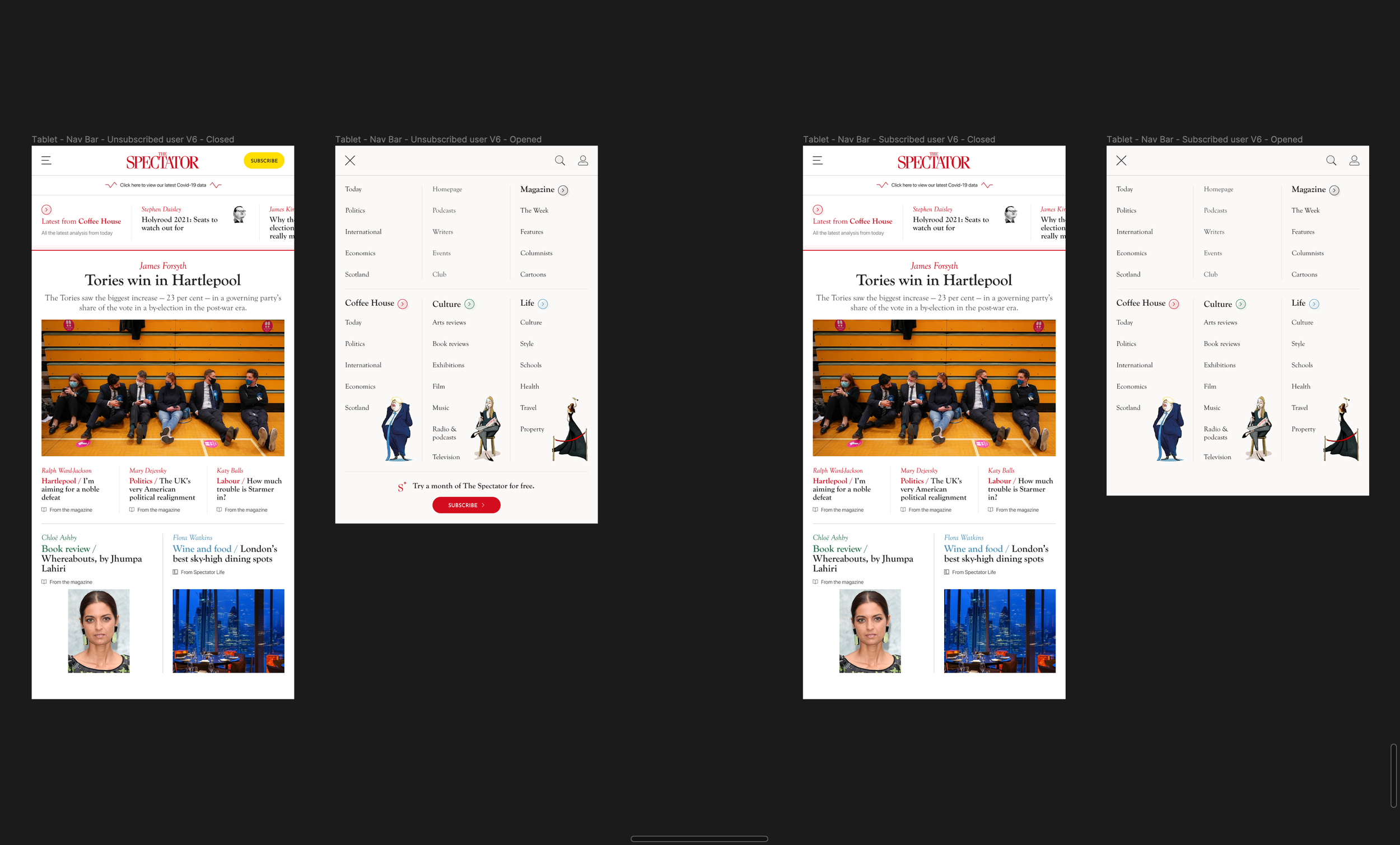
On the left, for unsubscribed users, and on the right, for subscribed users
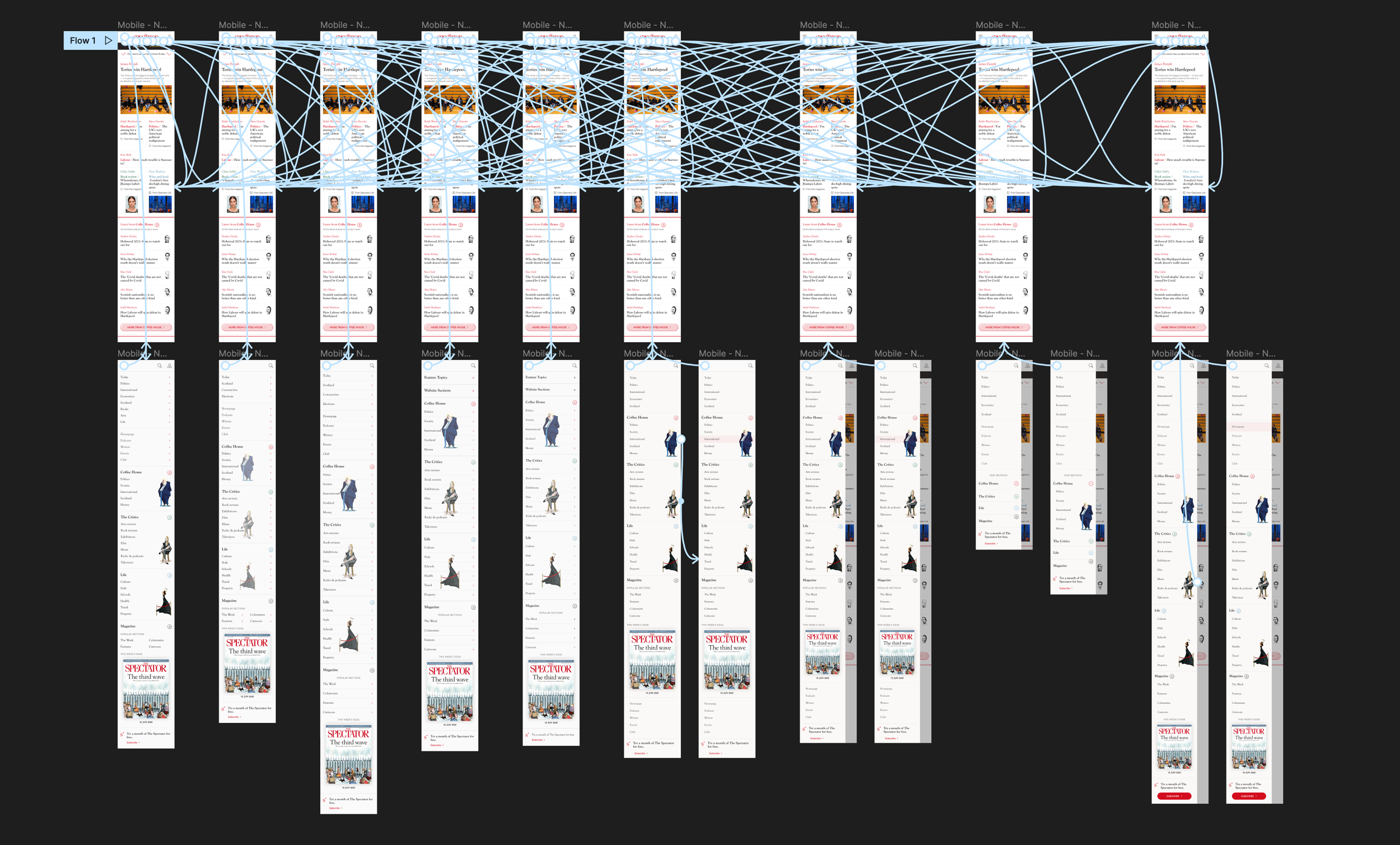
Navbar - Mobile breakpoint

On the left, for unsubscribed users, and on the right, for subscribed users
Footer - All breakpoints
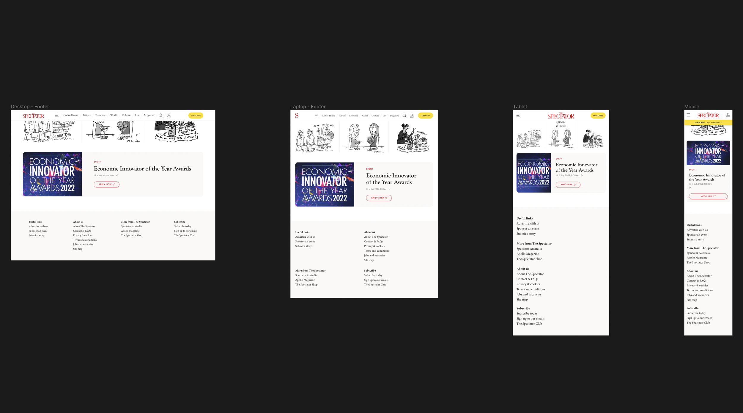
These are the Desktop, Laptop, Tablet and Mobile breakpoints