Platform improvements
Client: Echobox, an AI-powered SaaS automation platform for publishers
Timeline: Aug 2022 - Dec 2023
Roles: UX Researcher, UI Designer and QA tester
Devices: Responsive desktop
Technologies: Figma, FigJam, Zeplin, Jira, Dovetail, User Interviews and TestingTime
Project overview
This project collates multiple features I worked on throughout my time at Echobox for their AI-powered Email solution (that allows publishers to automate their email send-out), aiming to enhance our users’ experience in the platform and help them achieve their goals.
We did this by continuously listening to their feedback and iterating accordingly. We identified that the email templates, design customisation, and features to increase performance were the areas that needed improvement to deliver real value to our users.
I conducted user interviews, synthesised findings into reports, and used those to fuel user-centric designs that achieved the above, helped close more deals, and increased user satisfaction.
Objectives
After conducting user research, It was clear what I had to do, and I can summarise it into two very distinct groups, each with its unique goals:
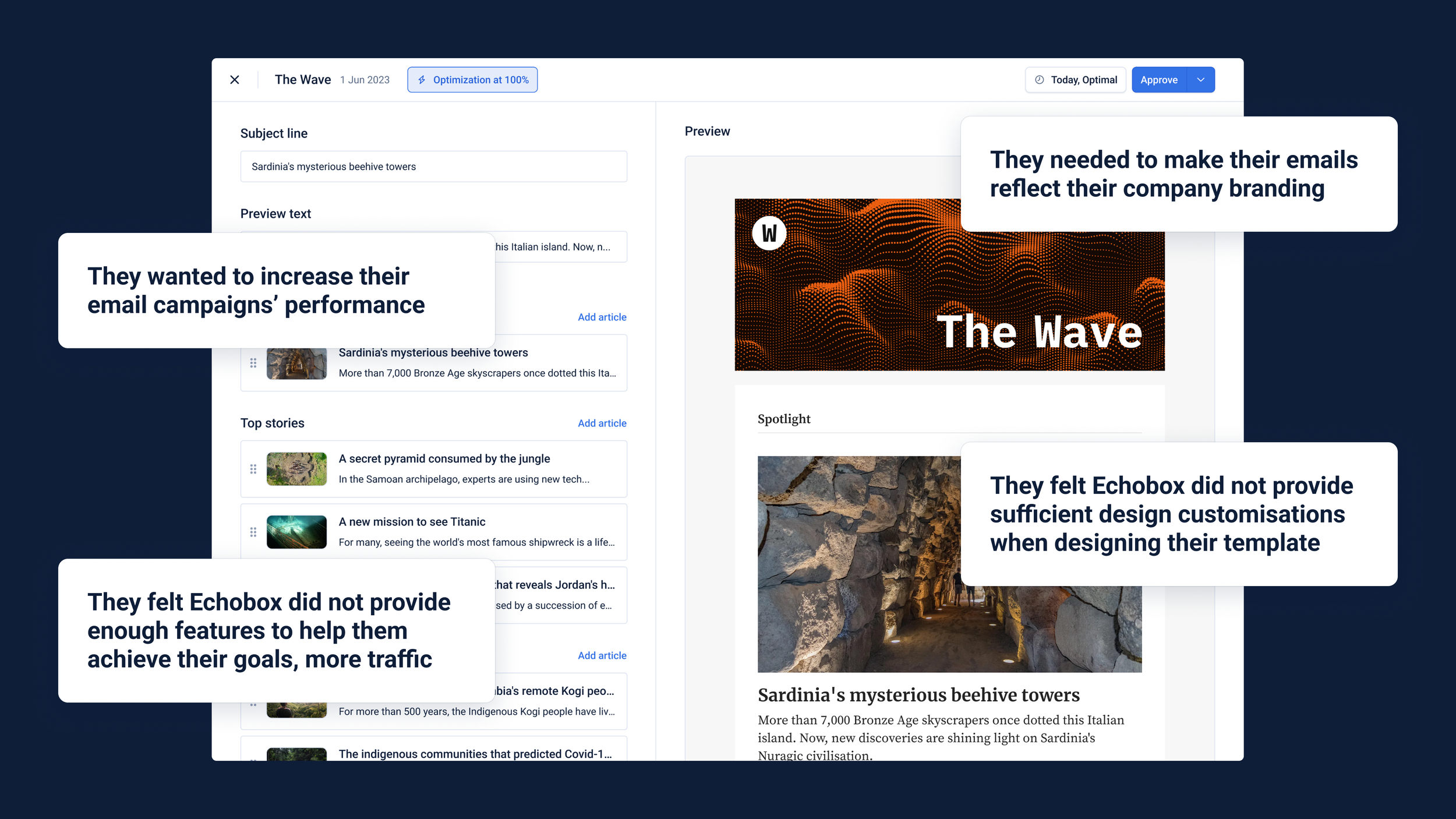
Provide more design flexibility and customization in email templates so that users could better reflect their branding in their emails
Provide more tools to increase performance in emails so that users could bring even more readers to their website
Challenges
Echobox has extensive data science research in the publishing area, and they know that in most cases, relying on algorithms and AI to make decisions is the best option to increase performance. As a company, we want to push for adopting AI features but not at the expense of users feeling obligated to. It’s their choice how they choose to go about it. All this posed a challenge:
How can we promote the adoption of AI features without making our users feel obligated to use them to achieve the best performance?
Techniques and processes used
User interviews
Competitive Research
Presentations
Design system and component building
Wireframing
Prototyping
QA testing
The Process
1. Finding what needed to improve with research
When I joined this company, it had already been quite some time since our users were properly asked about their goals, needs and frustrations with the platform and their roles. I conducted user research since we wanted to improve our products and the overall user experience.
A round of user interviews helped us frame their goals, which were to bring readers from the emails to their websites, their needs, more design flexibility when designing their email templates to match their company branding, and their frustrations, which were that the platform did not offer enough features to increase emails and campaigns’ performance.
In the latter area, our data science team had already researched what we could do to improve it. Still, regarding design flexibility and what we should offer, we
Therefore, I decided to benchmark email design capabilities with our competitors to find out what was out there already. I discovered that creating and managing multiple templates was ubiquitous and had a higher level of design customization.

2. Brainstorming ideas and putting them together
I got together with the Data Science team and PM to brainstorm ideas that would allow our users to increase their email campaign performance. We realised that AI-based features that would make emails more personalised to each reader were the answer. These were:
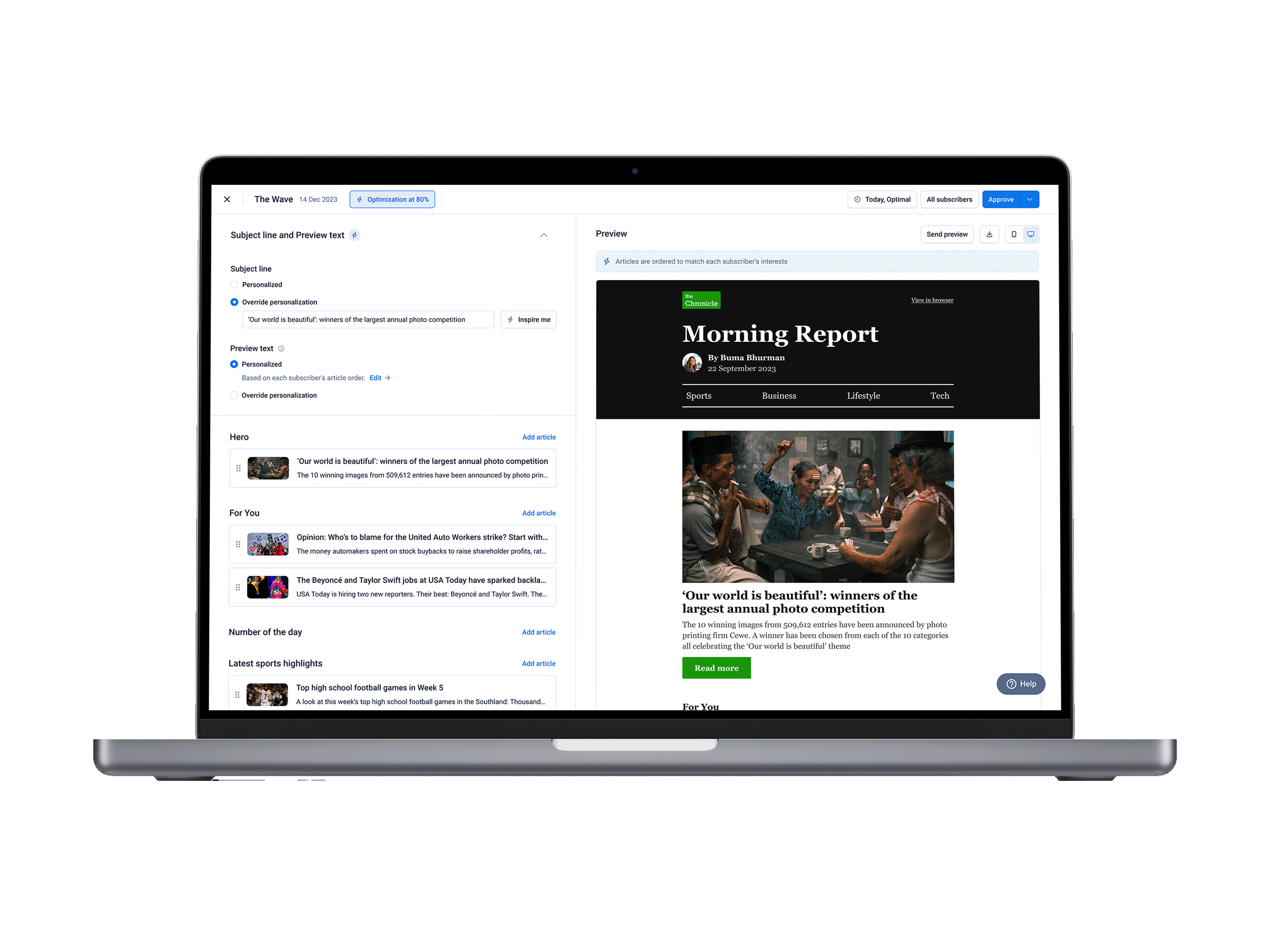
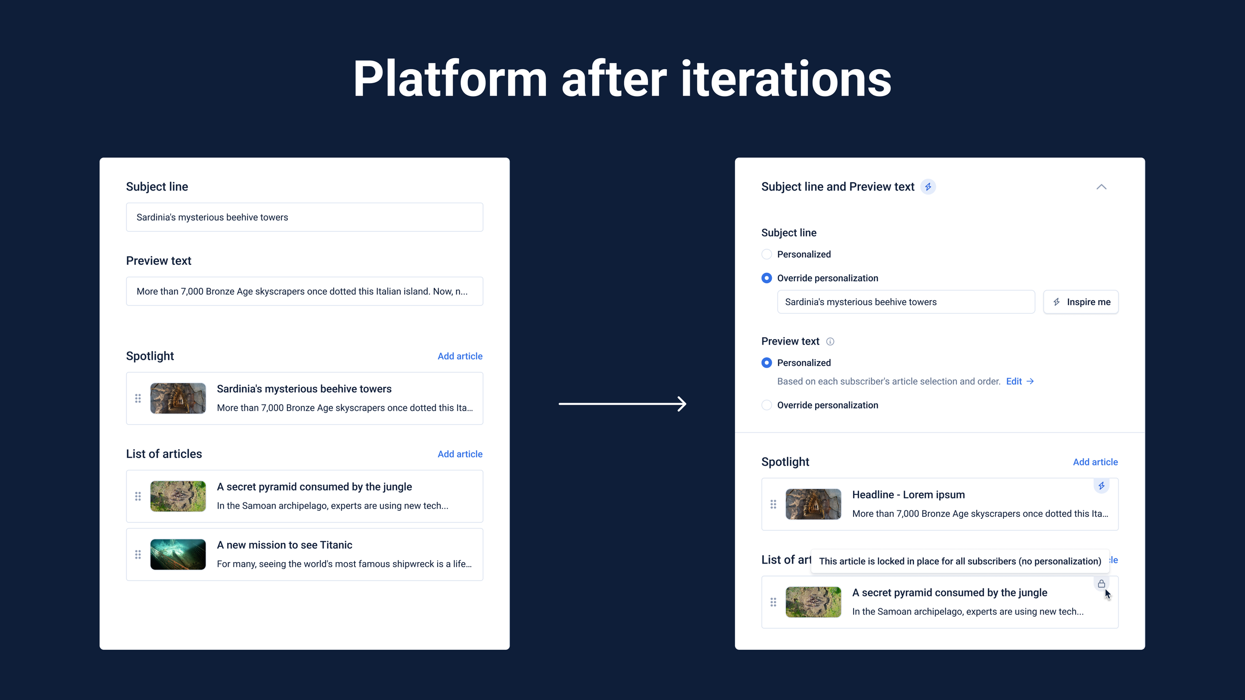
Ability to let Echobox select and order articles for emails based on readers’ interests, creating a unique content selection for each reader
The option to use AI to automatically set the subject line and preview text of emails, basing them on the articles the reader received
Regarding design flexibility, thanks to the benchmark conducted, we knew we had a major gap we had to fill. And it was clear what was missing:
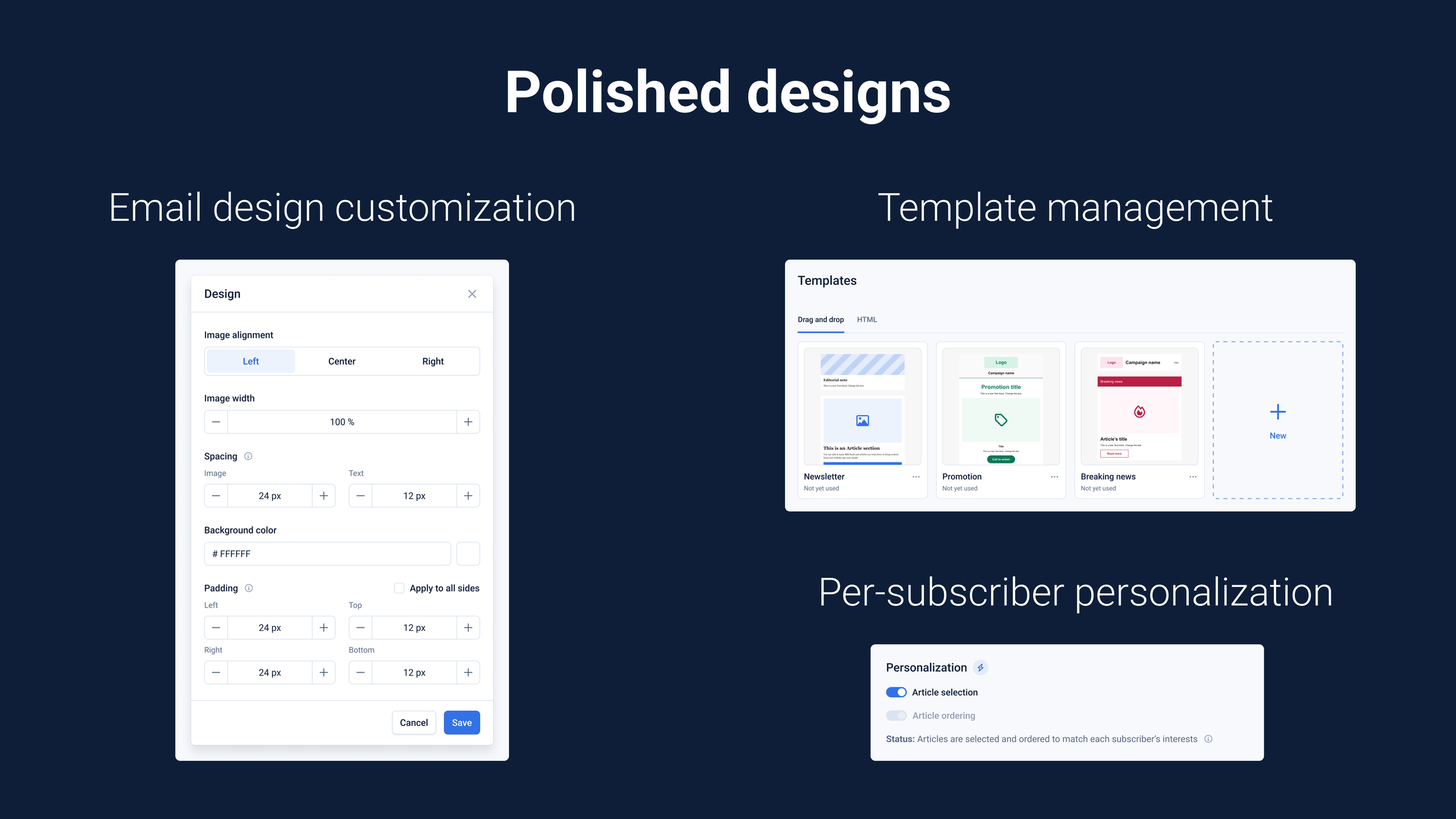
Ability to create and manage multiple templates so that users could have a bespoke one for each of their email campaigns
A higher level of design customization in templates to match the company's branding
I worked on those features in Figma, designing wireframes for each separately. Starting with less detail, getting internal feedback and improving them until they were robust enough to be presented to our stakeholders.
3. Addressing challenges and polishing designs
I would present them to our stakeholders in a design critique session, where I would get the more precise feedback I would use to polish the designs and get them to the highest level of detail, with all the edge cases and different functionally covered.
The overall line of feedback was around the challenge itself of this project. I struggled to present features in a way that didn’t feel like Echobox was forcing the user to use them and, in a very specific way, to maximise performance. Since we wanted to recommend and not force action, I reworked the wording and placement multiple times until they felt organic and optional but highlighted their benefits.
Given that most features were not high risk and we knew we would continue working on them, we decided not to test them before release but to release them, hear from our users, and iterate accordingly on the next released feature.
4. Dev handover, QA and continuous iterations
When designing, I would have regular catch-ups with developers and PMs to ensure my designs were technically feasible and aligned with what we wanted to do as a company.
The handover happened in Zeplin and Figma. In the latter, I had done loads of component building work and was responsible for QAing them as soon as designs were deployed in our production environment.
Once features were live, we would monitor them by getting data, checking it on Mixpanel, and hearing directly from our users in recurring user interviews or catch-ups. Depending on urgency, we would use this information to fuel necessary changes that would be implemented immediately or in the next iteration with the next feature.
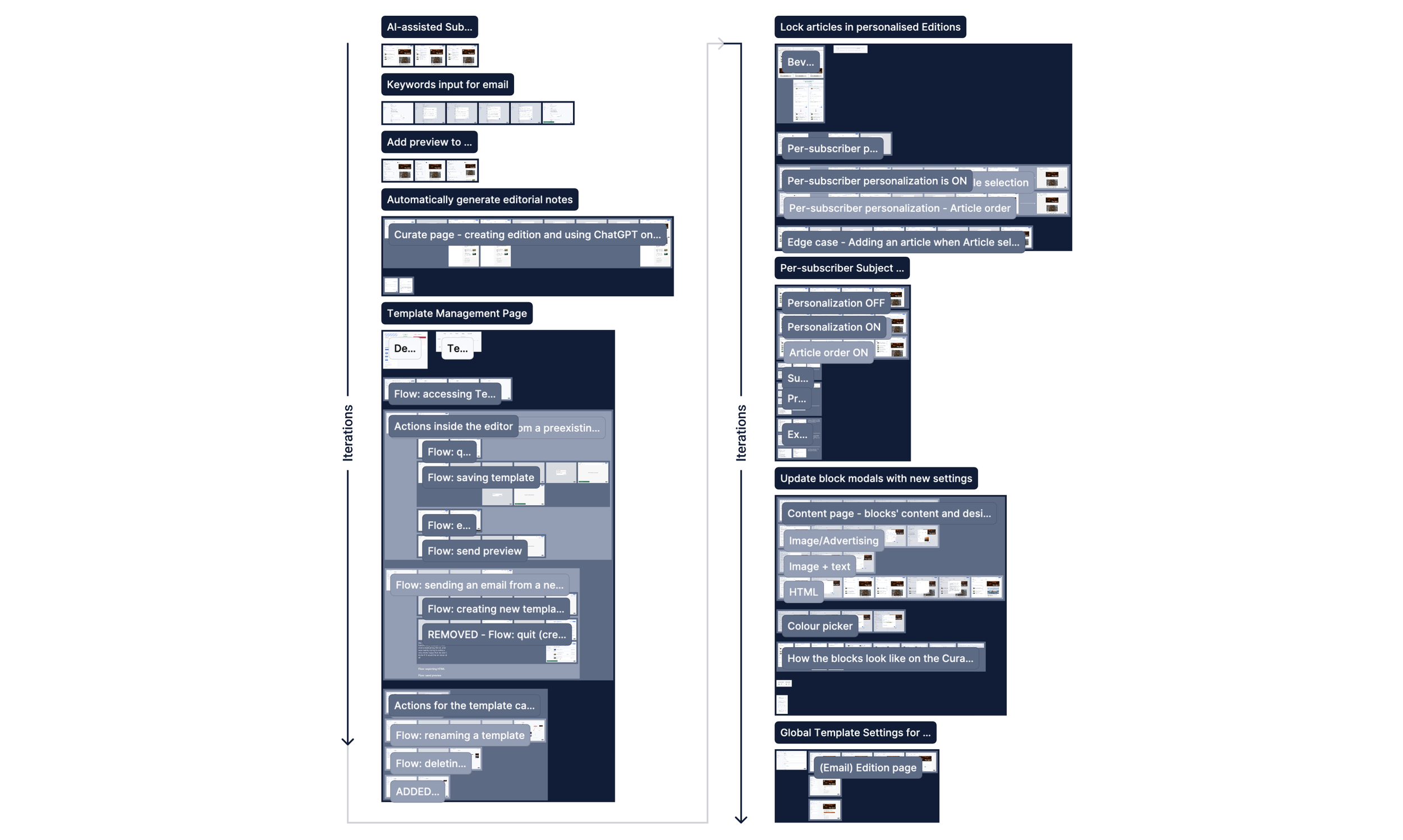
To date, we have developed over a dozen features that have continuously increased the platform's value for the user, making it easier for them to automate the send-out of highly personalised and customised emails to their readers while saving time and resources.
Conclusion
Outcomes
Many features were rolled out as part of this series of improvements to the platform to adapt and improve it for our users. I highlighted some of them below:
Templates management page for drag-and-drop and HTML ones
Higher design customization emails related assets
Echobox AI-powered article order and selection based on the reader’s preferences
Echobox AI-powered subject line and preview text
AI-generated text blocks whose content will reflect articles selected
Talking about numbers and how successful they were:
1/2 of active users have generated subject lines with AI
57% of email campaigns have enabled per-subscriber personalisation
31% increase in product MRR thanks to more design flexibility
Further testing and iterations
Some features stand by themselves and didn’t need to be updated when others are deployed. But some other features had to be iterated repeatedly to make them work with others as intended, to maximise their potential for the user.
For example, we released an initial, manual version of the ability to set subject lines and preview text with AI, which would work with a button. Still, after releasing the ability to let Echobox select and order the email’s articles (based on the reader’s interests), we returned to that initial version. We overhauled it to make it work with this other feature. Making it work automatically and considering the articles the readers would receive.
Finally, regarding testing, all features were tested by our users live on the platform, and their feedback, which was thought through regular interviews or catch-ups, was iterated accordingly once we had a clear idea of what needed to change.
The designs
If you want to check the designs, I have put together the wireframes of the main features we worked on for this project here. You can see the progression through time/iterations by following the arrows.