Transactional emails
Client: Echobox, an AI-powered SaaS automation platform for publishers
Timeline: Oct 2023 - Jan 2024
Roles: UX Researcher, UI Designer
Devices: Responsive desktop
Technologies: Figma, FigJam, Jira and Dovetail
Project overview
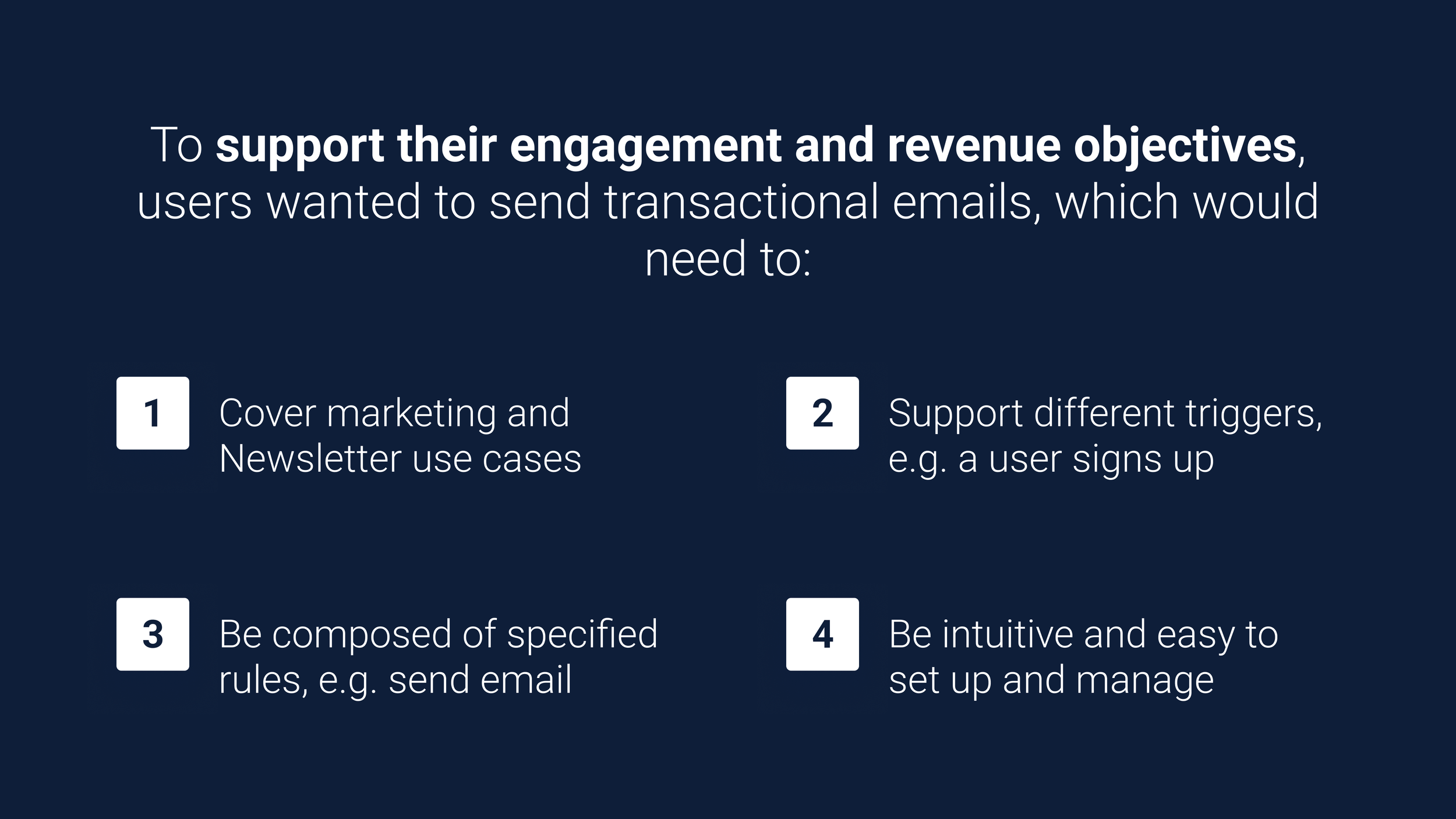
Echobox has an AI-powered product called Email, which allows publishers to automate their email send-out. But this automation is only limited to newsletters. From prospects and our users, we understood that we needed to support other types of email automation to help them achieve their engagement and revenue goals.
Through research, our PM and I dug deeper. We identified the most important use cases to cover, how the solution for setting up all the different types of email automation (e.g. transactional emails, the umbrella term) could look, and how it should work.
I designed the first iteration of the interface, creating wireframes to exemplify look and behaviour. I then agreed with stakeholders on a plan to gather feedback for the designs with the resources we had, getting users' thoughts on a call, which is happening at the moment. And after we collect enough information, I plan to iterate the designs, if necessary, before the dev handover.
Ultimately, we will have a user-centric, powerful feature that allows all users to achieve their automation goals, going beyond newsletters and expanding the product value proposition.
Objectives
Given the research conducted, we had enough clarity on what was missing, and I had to design:
A place where users can create and manage their email automations, see their information and performance (e.g. to check goal progress)
An interface page where users could compose their automations, making sure all use cases would be covered (e.g. re-engagement campaign) with dynamic triggers and steps
Challenges
This is a high-risk project involving complex features and flows. User testing was imperative, but we lacked the time to conduct proper testing, making the challenge:
When time is limited, how can we gather user feedback for our designs?
Techniques and processes used
User interviews
Competitive Research
Presentations
Design system and component building
Wireframing
Prototyping
The Process
1. Listening to users to identify Echobox’s feature gaps
Echobox’s Email product is still young, and while it offers great support for automating email campaigns (i.e. newsletters), it fully lacks for other types of automations (i.e. events and marketing). We knew this because our users (through regular catch-up calls) and prospects (through demo calls) highlighted the need for our product to cover more types of automations since they had goals that wouldn’t be achieved with regular newsletters.
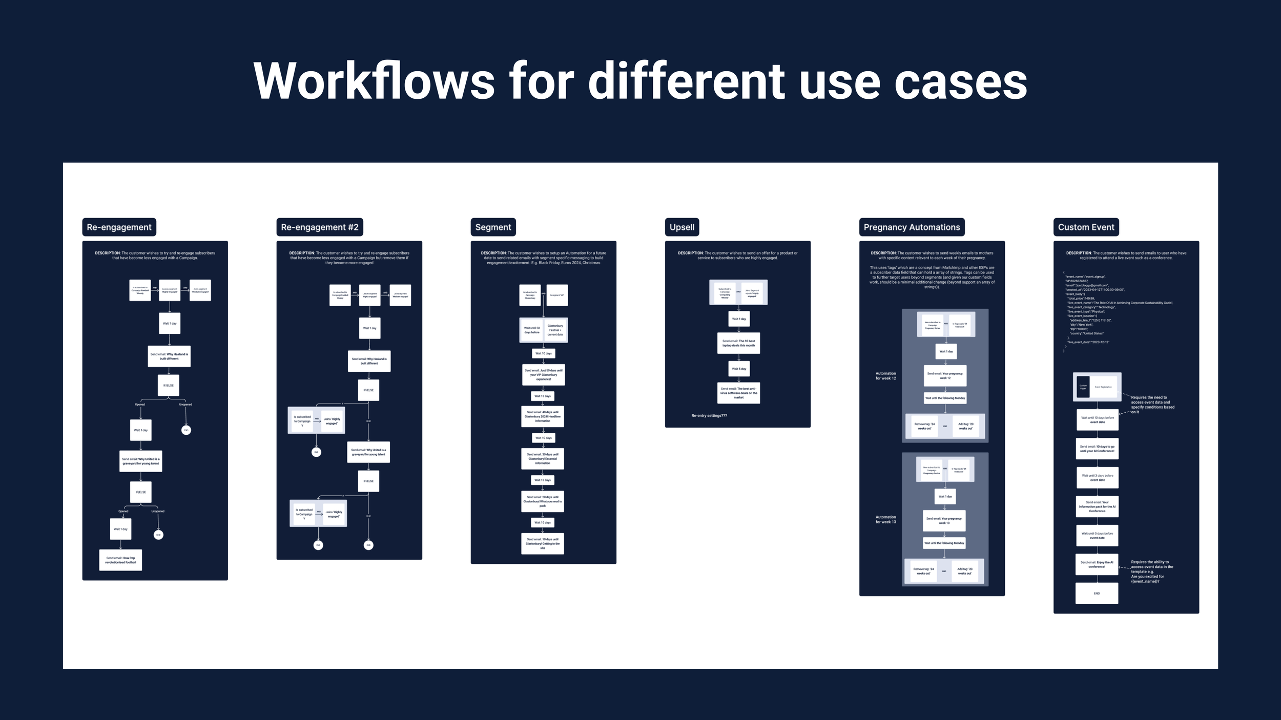
Our PM reviewed all the user information about the subject and identified the use cases we would need to cover with events and marketing-based automation. Some of them being welcome series, birthdays, re-engagement and upselling campaigns.
We then benchmarked how other email platforms covered those automations to understand how this project could work and look. We identified we would need to design multiple interfaces where users would be able to:
Create and manage their automations, and visualize their performance
Build the automation’s workflow, with different types of triggers and steps
2. Mapping what needed to be design and creating interfaces
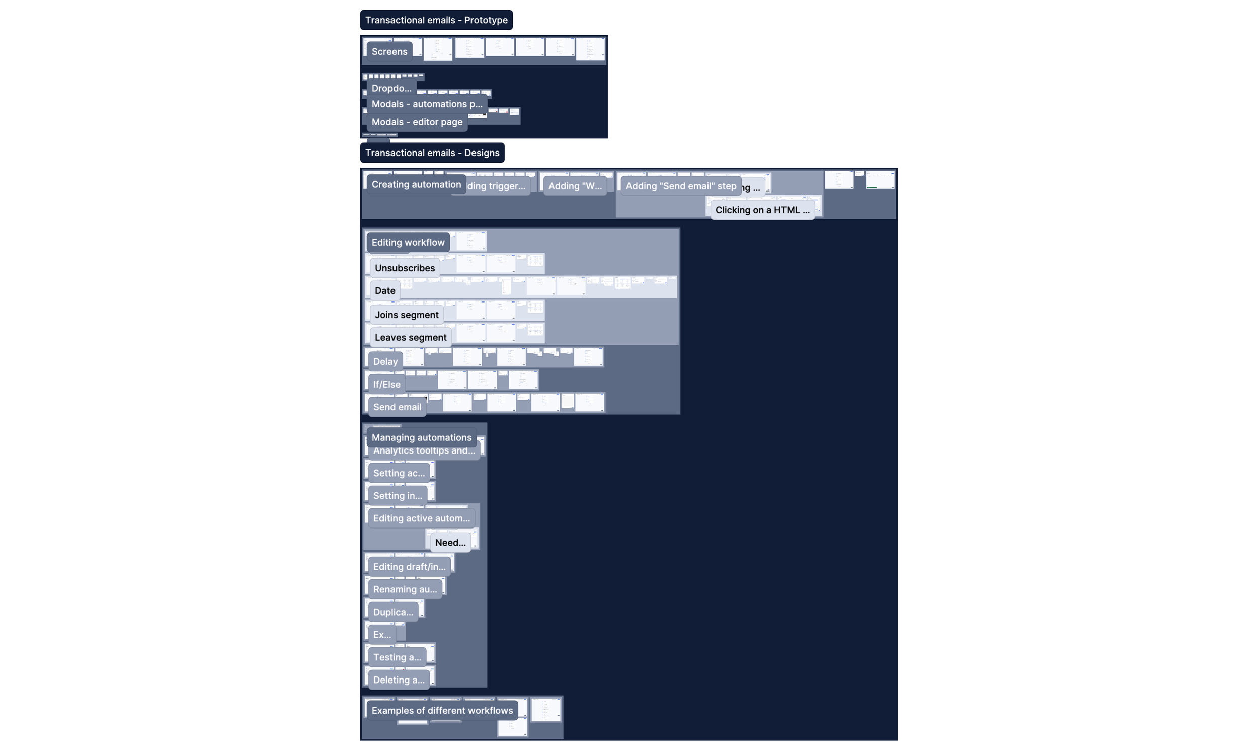
Given the complexity of the project and the multiple use cases we identified, we decided to map out the different workflows that would cover each use case. This helped us understand what triggers (e.g. user joins a segment or signs up for a campaign) and steps (e.g. waiting a set amount of time or sending an email) we would need to design.
On Figma, I started to put together the wireframes that would display the interfaces to access and manage automations (i.e. the Automations page) and to build and edit their workflows (i.e. the Composer page). I started with less detail and would get internal feedback to improve the designs and add more details.
Once I got all of these designs to a robust state, and given that we had too many of them and I wanted to get feedback on the journeys that users would have to follow themselves, I decided to prototype two flows to cover each of the two pages I designed, with their intended behaviour and capabilities.

3. Presenting, getting feedback and updating designs
I shared and explained my designs and prototypes with stakeholders (e.g. our product team and leadership) to get more detailed feedback in our weekly design critique meeting. I used this to iterate the designs and repeated this process until we all felt the designs were intuitive enough and that they covered what was needed.
A piece of feedback which was recurrent was around the overcomplication of certain flows, such as the setting up of the trigger, or starting point, of the workflow (which you can see on the left, the three grouped cards). I solved it by keeping the UI to a minimum while not losing functionality and making it easier for users to set up.
While sharing these designs, we realized we had to add more components and behaviours to cover all identified use cases fully (e.g. overhaul the delay step). We ended up designing this project as the end goal since we also wanted to ensure that all different areas worked together seamlessly, were intuitive, and no user’s need would be left out.

4. Finding a way to get real users’ feedback before implementation
When I finalized to put together the end goal state of the designs, it was more than clear that user testing was imperative, given the volume and high-risk quality of it. Unfortunately, given a change of priorities, we did not have enough time to recruit and conduct monitored tests to identify any usability issues.
Therefore, leadership and I devised a plan that, whilst not ideal (since it’s not really user testing), would ensure getting users’ input on the project, and regardless of how it would go, time spent would be minimal.
On our regular client catch-ups and demo calls with prospects, if they are interested, we would preview a simple prototype showing different automations and what actions and information you could take and get from there. We would get their opinions, answer questions, and ask what was missing or what didn’t seem to work for them.
This plan is in action so far, and as soon as we collect enough information to get a picture of how real users feel about the project, I will translate the insights into design changes to improve the UX. After this, a final clean-up of the Figma files and then the dev hand-over.
Conclusion
Outcomes
We are still collecting user feedback on the designs, still, given that we used user input and ran extensive benchmarking research to create this project, we can safely highlight some outcomes:
The Automates page, where users can easily create, monitor and manage their automations to achieve their marketing and event-based goals
The Composer page, where users can accurately build those automation workflows
Next steps
After we gather enough information to build a picture of how users feel about the project, I will make any necessary design adjustments and decide whether more user feedback is necessary before the handover and implementation.
Finally, like the rest of the projects in Echobox, continued monitoring will ensure we identify usability issues and ways to improve the UX.