
Website conversion funnel
Client: The Spectator (1828), a digital/print publishing company
Timeline: Dec 2021 - Feb 2022
Roles: UX Designer, UI Designer, QA Tester
Devices: Responsive website, desktop-first approach
Technologies: Figma, Contentstack (headless CMS), Keynote and Jira
Project overview
Objectives
This project was requested by the Chairman of the company, Andrew Neil because the growth of our subscribers was decreasing. He decided that we, both the Digital and Marketing departments, had to redesign the conversion funnel inside the website; which is where we convert most of our non-subscribers into subscribers by showing them a series of subsequent banners (which is the Meter journey) when reading articles and making them register for free articles and later on subscribe for unlimited ones in the Join Page.
Specifically to our department, he wanted me to:
Redesign the current assets; anonymous banner, datawall, registered banner and soft and hard paywalls, to make them more visually appealing
Explore new and more effective ways to push a trial period, as a new “1 month free” marketing strategy was going to be put into place
Adjust our Join Page to match the updated designs; this page is where users purchase the subscriptions
The Challenge
When talking about red numbers and subscribers, and having an initial not very specific scope for the project, a lot of pressure was put into our department, and on me most specifically. This was one of those projects were tiny details were expected to have big positive consequences, and therefore I felt that this was our challenge:
How can we make the meter journey much more effective by just adjusting the current design with small tweaks?
Techniques and processes used
Benchmarking and Competitive Research
Presentations
High fidelity Wireframes
Prototypes
QA testing
The Process
1. Benchmark and synthesis
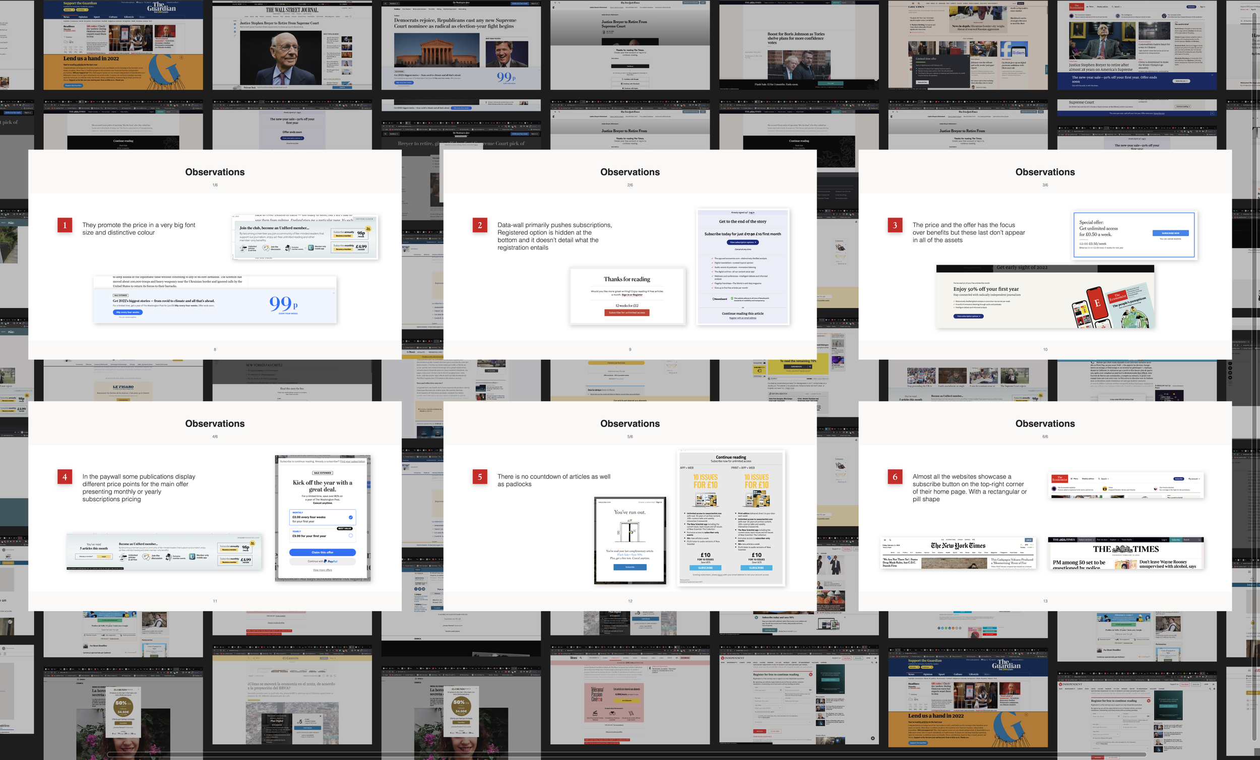
To embark on this design journey, I decided to compare our different assets to the ones from the competitors to understand how where they presenting different offers, and how and what they were displaying in each separated banner in their user converting flows
I found that not all publications have a registered state for their users, and therefore decided to hone in the research on the ones that do have such a state, as we have it too. I realized that, overall, a shorter copy was used, using big fonts on pricing, and that on the datawall (the banner that asks the user to register in exchange for article allowance) the focus is on listing the subscription benefits rather than on the paywall (where we ask the user to subscribe), where the focus is in pricing.
Conducting further research on unrelated apps, I found that a way to build trust with the user when promoting the “1 free month trial”, was to explain in detail the progress of the trial and let the user know what would happen in each stage from day 1, succinctly (you can see it in the Variant 1 for datawall, soft/hard paywalls on the prototypes.)
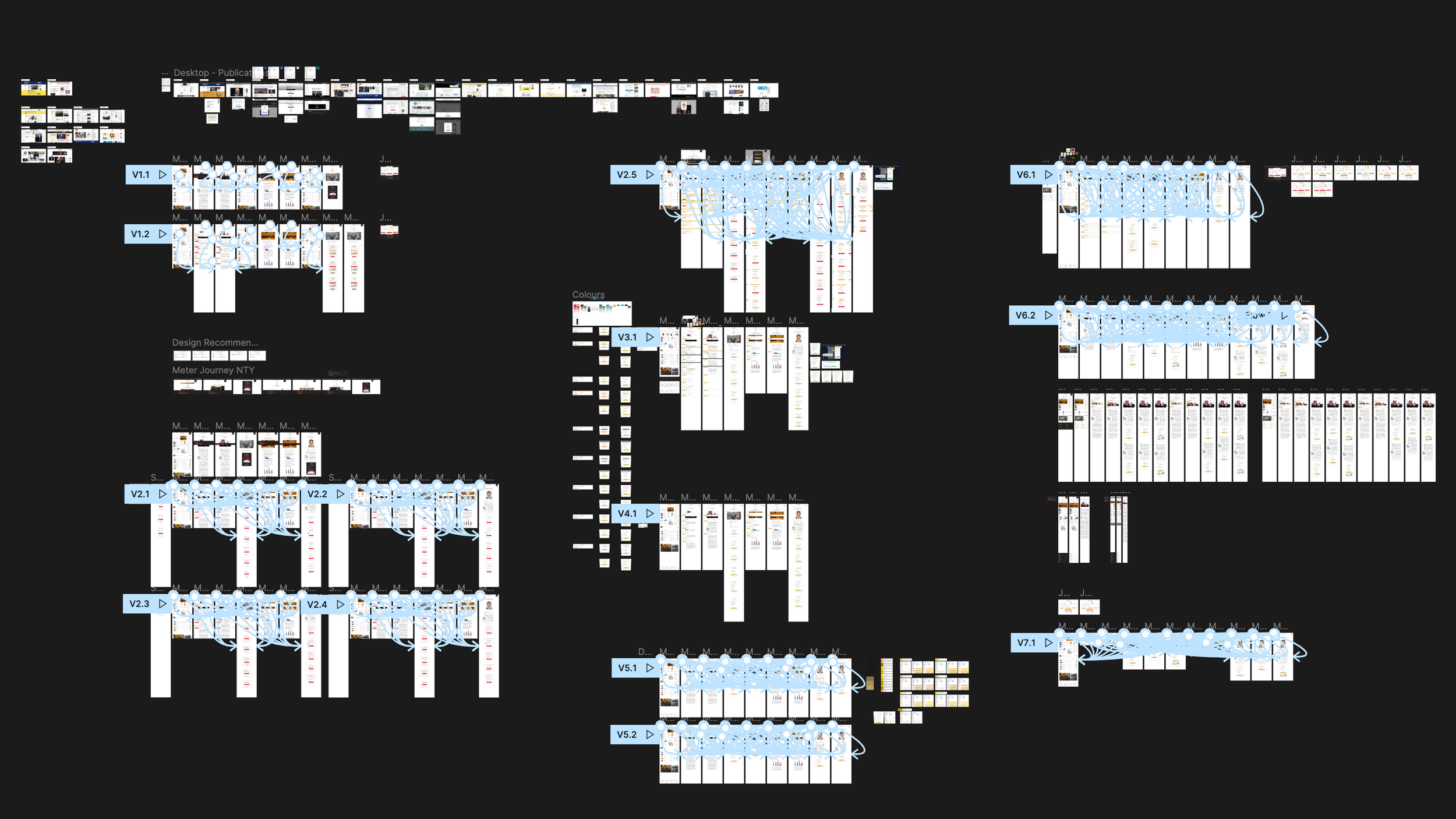
2. Design and prototyping
Haven written down the ideas I wanted to explore, I began to design desktop-first approach wireframes where I first apply overall changes to the typography and colour palette of the assets (increasing the font size on specific fields and using a white background and a single accent colour) and then made more specific changes to each asset, keeping in mind that we wanted all the fields and features inside them to be editable and shown on/off to guarantee the possibility of future changes without dev work.
Going back to the challenge of this project, what I was trying to do was to tweak the current designs and present different arrangements of the preexisting field (e.g. heading, subheading, list of benefits, images, etc…), making small changes to help us align ourselves with the competitor’s strategy that seemed to be working.
After finishing each version of the desktop prototype flow, I had catch-ups with my PM to ensure that we were heading in the right direction, and after multiple iterations, we came up with a robust prototype that we felt confident with.
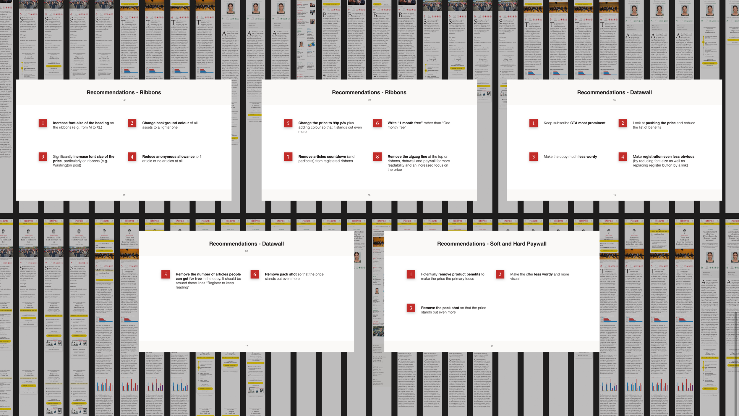
3. Presentation, breakpoints and feedback
I gathered the research I put together and assembled a presentation to help sell the distilled insights and design choices made. I then presented to the Marketing team, CMO and CFO, and received generally positive feedback although a few changes had to be made, for example; changing the design of the countdown (for limited time offers), and changing the accent colour (which was a muted gold that then became a bright yellow.)
Shortly after, I moved into designing the rest of the breakpoints (laptop, tablet and mobile), made prototypes and presented again for a final round of feedback, gathering their feedback and applying it back again.
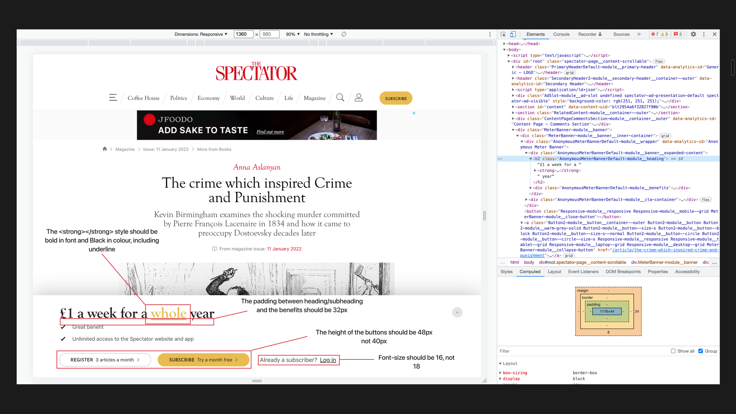
4. Dev handover and manual QA testing
Having designed all the screens and consolidating all the changes, I cleaned the file of any undesired design leftovers and moved it into a new file that was shared with the dev team, and then had a few catch-ups with them to explain the designs.
I checked and QA tested all the designs on the Dev environment and raised issues tickets on Jira with screenshots and details of what was wrong and what it had to be changed. The dev team fixed the issues and then deployed on the Preview and subsequently on the Live environment, and I QA tested each deployment.
Conclusion
Outcomes
In terms of designs, I came up with:
Redesigned assets with new functionalities, such as the new assets for Datawall, Soft and Hard Paywalls that foment users to try the “1 month free.”
All the assets fields are editable, to ensure adaptive designs to new strategies.
Updated Join Page, with a more cohesive design to the rest of the website, not just the new Meter Journey.
In terms of performance, tracking data with Google Analytics, we discovered:
26% increased conversion rate for subscribers, after one month of deployment.
29% increased conversion rate for registred users when using the new designs specifically for the “1 month free” on the Soft and Hard Paywall
Further testing and iterations
This project was tested inside the company by my PM and myself with members of different departments of it and small changes were made; some of the proposed wording had to change and tweaks of font sizes and paddings in the Join Page.
After deployment, and with the refactoring of our website components in NextJS, I subsequently QA tested the assets again, to ensure that they and their functionalities would remain as intended.
The designs
Below I have attached images of all the final designs, but in case you want a look a closer look at them, you can check these prototype links:
Just make sure to check the flows panel, which can be accessed through the top left icon next to the Figma icon (colourful F icon.)
Meter Journey and Join Page - Desktop breakpoint
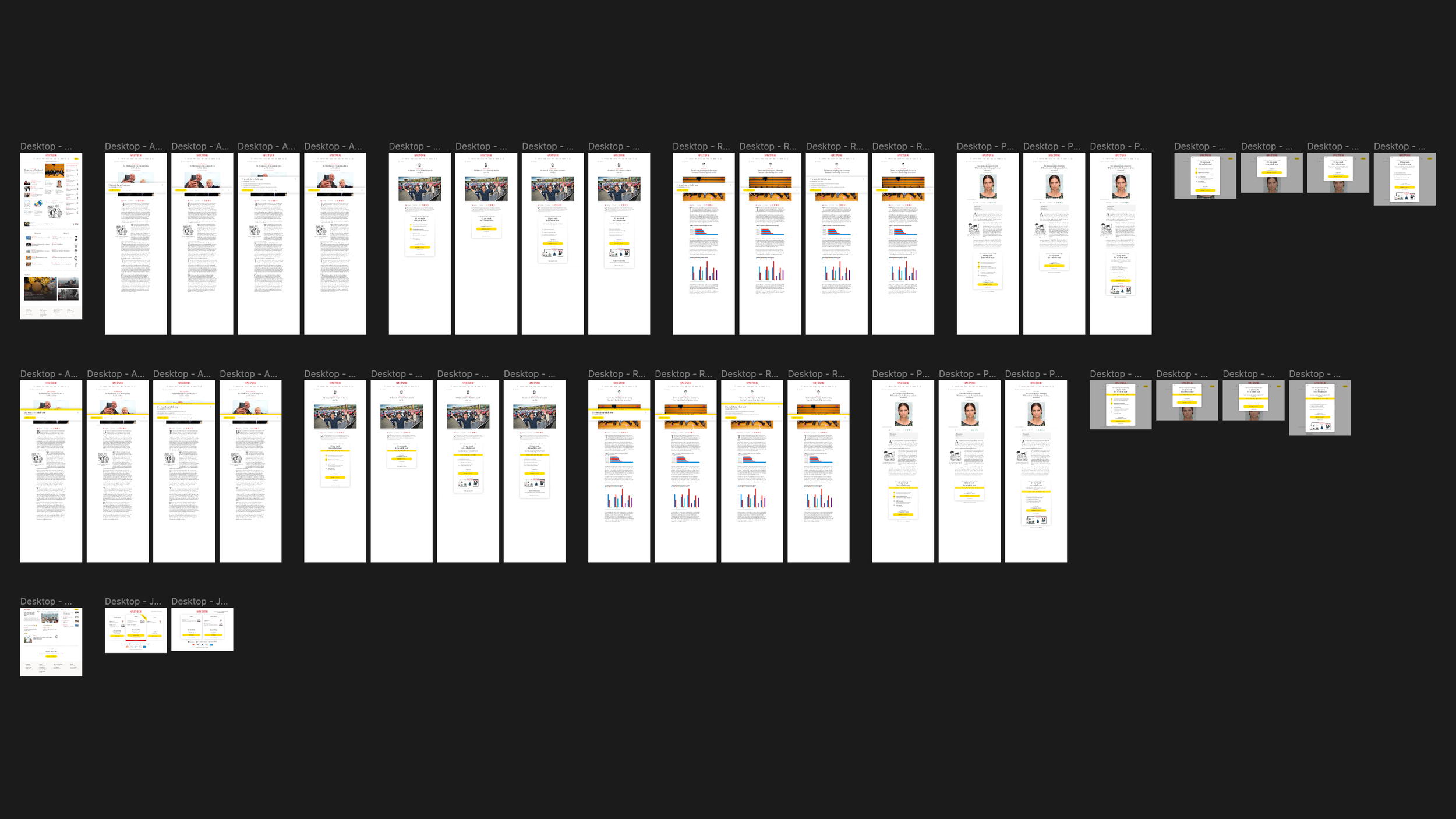
First row: Meter Journey without the countdown. Second row: Meter Journey with the countdown. Third row: Comment section and Join page.
Meter Journey and Join Page - Laptop breakpoint
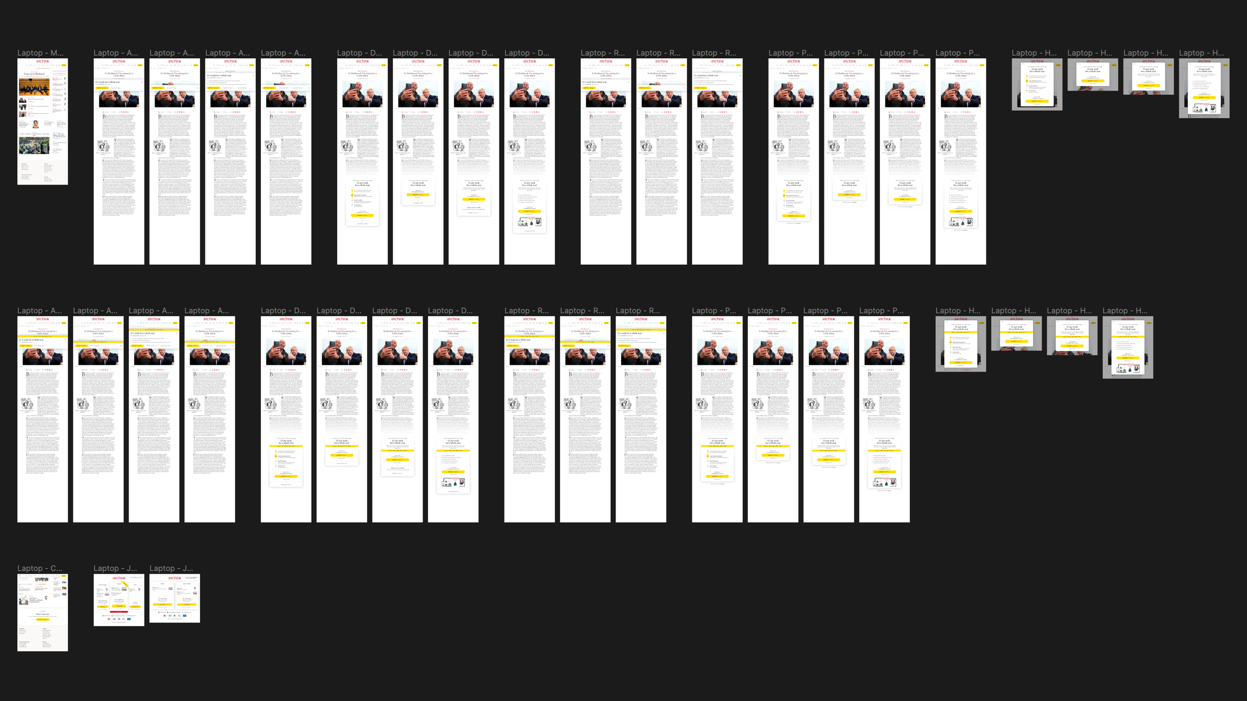
First row: Meter Journey without the countdown. Second row: Meter Journey with the countdown. Third row: Comment section and Join page.
Meter Journey and Join Page - Tablet breakpoint

First row: Meter Journey without the countdown. Second row: Meter Journey with the countdown. Third row: Comment section and Join page.
Meter Journey and Join Page - Mobile breakpoint
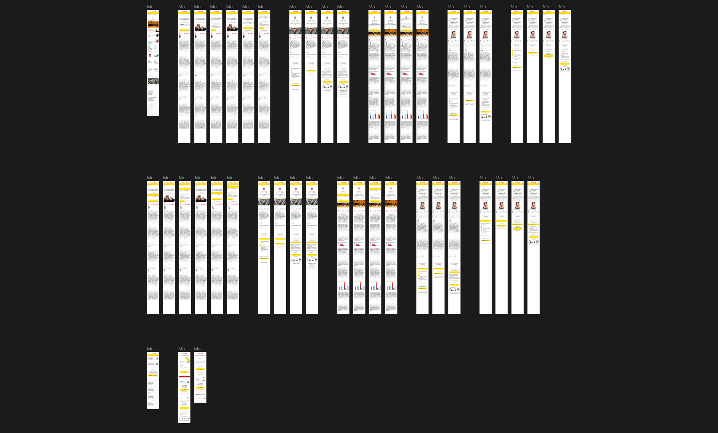
First row: Meter Journey without the countdown. Second row: Meter Journey with the countdown. Third row: Comment section and Join page.